I had intended to do an end-of-2023 wrap of the books I read and went so far as to run my eye over them all on Goodreads and start to extract some themes, but in the end I just needed a break this summer. Instead, I've decided to try to do a seasonal wrap, so here is my first: books finished in Summer (between 1 December 2023 and 1 March 2024).
If so inspired, you can follow me on Goodreads.
Stats
- 16/34 books were published in 2023
- 2/34 published 2020-22
- 16/34 published before 2020
- 18/34 are ostensibly children's or YA literature
Top 6, if you made me pick:
- A Touch of Mistletoe
- North Woods
- Lanny
- The Windeby Puzzle
- The Grimmelings
- Bird Life
Notation
# a book I own (if you want to borrow)
% a book that's ostensibly children's or YA literature
% # Elizabeth Warren, The Wandering Wombles, 1970This list would have started a bit more impressively if I lied and brought forward Benjamin Myers highly respected Cuddy (a book I'm still thinking about regularly) which I finished on Nov 30. Instead - Wombles.
Read because I had been backreading a lot of books from my childhood prepping to interview Christchurch author Rachael King at the Writers Festival at the Aotearoa NZ Festival of Art. I was thinking a lot at the time about "tropes" (unkind word) - perhaps "building blocks" - of children's lit: absent parents, portals between worlds, magical transport.
The Wombles is Beresford's 1960s/70s series about ambulant, pointy-nosed, furry, human-language-speaking creatures who live around the world but most famously on London's Wimbledon Common, and "making good use of things that we find", upcycling and rehabilitating the things humans throw away. The series was adapted for an animated tv series which might have been how I first encountered them? Unsure.
The Wombles are classic world-within-world: secretly occupying spaces around humans, building their lifestyles around what humans discard, and negotiating those times when the two systems overlap (I did not recall at all from childhood that Wombles only come out at night). In the biographical statement at the end of the book it’s noted that Beresford wrote quarter of a million words per year. Maybe that’s why this book felt a tad perfunctory— the prose isn’t really any better than it needs to be, in order to get you through the book. Did I notice as a kid that the only female characters are a teacher and a cook? Possibly not. And all the commentary about weight — Wombles are meant to be sturdy but the acceptability of this is tightly patrolled, with many a condemnation of the ones who get too tubby. But series like this probably rely on repeated motifs, catchphrases and features that become instantly familiar, which is how reading this book felt.
Read because as above - revisiting childhood reading. I went back to this book with trepidation and emerged from it soothed by the familiar shape of a story that soaked deeply into me as a child, but still questioning.
O’Dell’s book — the 1960 Newbery Award winner — is based on the true and tragic story of “Juana Maria” or “the Lone Woman of San Nicolas Island” (her Native American name is unknown), a Native Californian woman who was the last surviving member and last language speaker of her tribe, the Nicoleño.
She lived alone on the island from 1835, when the rest of her community was removed by an American schooner (the motivation for their removal is somewhat unclear). The community has been decimated about 20 years earlier, when a ship full of otter-hunters managed by the Russian-American Company had arrived to hunt and then (perhaps provoked, perhaps not) attacked the island’s inhabitants.
In 1853 she was found / tracked down / removed from the island and taken to the mainland, where she was thought to be around “middle-age”. Accounts from the time describe her as lively, fascinated by horses, engaging and engaged. She died of dysentery after 8 weeks.
O’Dell gives her the name “Karana”. Karana is 12 when a ship of Russian otter hunters arrive on her island. Her father, the village's leader, negotiates and agreement with the captain which is later broken, leading to a fight where many of the island’s men are killed. The next leader departs by canoe to find support; shortly after an American ship arrives and all Karana’s community gathers to board the ship. Karana is onboard when she realises her brother has been accidentally left on the island — she dives overboard to retrieve him but the ship, threatened by a storm, departs. Karana and her little brother are left alone on the island.
If you’ve not read the book I’m not going to spoil it for you. It is simply told, intensely imagined, almost anti-lyrical in the exactness of its language, but closely observed and utterly centred on Karana’s resilience, resourcefulness, and ability to exist in her isolation.
I can remember being entranced as a child — do all bookish kids prepare for that rare chance that they too may one day be abandoned / forced to become a knight / find themselves on a quest? As an adult, I’m conscious O’Dell is telling a story of colonisation, as sensitive and non-judgmental as it is. I wonder if the simplicity of the language and lack of reflection awarded to Karana is meant to indicate some kind of noble savage, unspoiled innocence. And yet I didn’t get the squicks so many books from earlier times give rise to: I would happily read it again.
Read because it was on the recommendations display at Unity.
Thoroughly competent and charming queer YA that plays to the historical romcom genre. Would make a great gift for a teen in your life.
% J.M. Barrie, Peter Pan, 1911
Read because inspired by listening to the
Bookwandering episode where Anna James talks to Nikita Gill about the book.
Okay. The book is definitely racist. The "be my mother" storyline around Wendy is disturbing when you note it's being played out by kids younger than her (acceptable), kids her age (hmmm) and adults (Barrie had a complex family history). But if you can get past those factors (and I don't blame you if you can't set it aside, not everything needs to last forever) my god, is there some fantastic writing and some truly surreal stuff in here. It is utterly a book for adults to read with a noticing eye. I'd love to have time to read this more deeply and write about it to understand it better.
Read because was mentioned by a person whose reading I admire when I asked her what was on her pile at the moment.
Charming, quite beautifully structured but also (unsurprisingly, really) quite pot-bound by the then-83 year-old author’s class and life experiences. Really beautiful cover though.
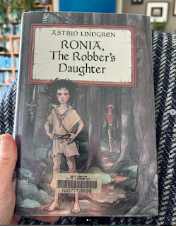
Read because earlier note about childhood re-reading
Utterly as wholesome as I recall it being. From the first page I remembered it all — black-eyed Ronia, the treasured only daughter of the adoring, emotional, bellowing robber chief Matt, his unflappable wife Lovis, the 12 dirty loveable robber rogues in their band, their stone fortress in the woods, the rumphobs, the harpies, the gray dwarves, the wild horses — and the rival band of robbers led by Borka and his gentle, brave son Birk …
There’s not a lot of plot to the book — some fairly gentle action but the real focus is on the emotional growth Ronia experiences along with her father. Really quite beautiful.
Read because I noticed the cover on the new books shelf at Good Book Shop.
The concept was intriguing: a novelist's wife turns into a garden on the second floor of their home. I read very little in translation (something I should probably work on) and I struggled to mesh with the tone of this book.
Read because someone whose reading I admire recommended a more recent book by Winterson to me, but this was just lying around at the library so I grabbed it.
The first two chapters filled a Hilary Mantel-shaped hole in my heart with their historical setting and characterisation, but my interest waned towards the end.
Terrific time-slip fiction. I've been aware of this book since I was kid, but never got around to reading it. The tension Pearce keeps up between which of the main characters will turn out to have the 'real" timeline is so well done.
And speaking of such topics - over Christmas I also listened to the wonderful
BBC adaptation of The Dark is Rising which I can't recommend enough. Gloriously read, and with a beautiful soundscape. Save it up and listen when it's cold - it sat weirdly with hot windy days in the Wairarapa.
Read because another recommendation from the Unity Books staff picks display
It’s 2061, and a solar flare has knocked Halley’s Comet off course and directed it head-on into Earth. 12 year-old Petra Peña’s parents, renowned botanist and geologist, have secured spaces for their family on one of three shops that will leave Earth and travel through time and space to a habitable planet. Some travelers will be placed in stasis & plugged into Matrix-style learning programmes to be the first settlers on the new planet: others, the Monitors, will carry an intergenerational responsibility to care for them until that time.
Except Petra’s programme doesn’t work properly, and when she is wakened from her stasis and encounters the totalitarian Collective that now runs the ship, she will have to draw on all the wisdom of her parents and especially the folklore her abuelita taught her to survive …
It’s a gripping set-up and very cinematic, moving between spaceship drama and magical Mexican folklore. As an adult reader though you can feel Higuera just trying a bit too hard with it all, and over-playing the sentimentality.
Janina Ramírez, Femina: A New History of the Middle Ages Through the Women Written Out of It, 2022
Read because I noticed it on the shelves at Good Book Shop but know better than to buy myself non-fiction books I'll only read once (if I even make it to the end of them).
The last year or so of my reading has had a semi-intentional medieval(ish) thread: Haven, Matrix, Hild, The Beatryce Prophecy, Eleanor Parker’s calendar of the Anglo-Saxon year. That’s meant a lot of people’s research re-absorbed, some lightly wielded and some rather heavily apparent.
Ramirez’s book starts strongly with an introduction looking at some Suffragettes who were also medievalists, a field of study that exposed them to the silencing effect of the Victorian “great man” style of history-making.
It then moves through about 6 centuries of women’s lives — some identified, like Julian of Norwich and Jagwida of Poland, and others stubbornly anonymous, known only by their burial sites (the Loftus Princess, a black African woman buried in a London plague pit) or the work they left behind (the Bayreuth Tapestry).
Throughout, Ramirez argues for a history of the medieval period that’s less binary, more compassionate, more complex and more comical than our received tropes would suggest. It became a bit of a slog towards the end (I think I'd just had enough of this particular plate of pasta) but a million more instances of historical fiction could bloom out of this one.
Read because I brought a couple of Comyns' books home from me from a trip to London last year: Daunt Books editions picked up at Hatchards. Part of a few years now of back-reading steely mid-20th century British women novelists.
I loved this. I love the slightly chaotic nature of Comyns' writing: she just throws everything at it. A Touch of Mistletoe had me thinking about my all-time favourite book, I Capture the Castle - it's like Comyns took Rose and Cassandra out of that book, made them over into Blanche and Vicky for this one, and then threw life at them. Highly recommended.
Read because this was me getting stuck into my summer reading, and the pile of books I'd been building, like a beaver with its dam, over the second half of the year.
A peaceful, contented book full of love — love of place, of cherry trees, love of a grandmother, of three beautiful grown daughters, love for one’s young self and love for one’s middle-aged, fulfilled self. In other hands such a story could be cloying, but Patchett draws you in close with her storytelling. It’s like the authorly equivalent of lowering your voice to reel listeners in.
Read because I'd heard Hargrave on the Bookwandering podcast and really enjoyed her episode about Garth Nix's Abhorsen sequence.
Wolf Queen was hyped on a bunch of end of year lists (the British kids / YA author community is social-media-tight) and I have an interest in the green magic genre. I wanted this to be a bit deeper than it was though - the world-building could've been pushed a bit further out. I found myself thinking of Frances Hardinge's Gullstruck Island, another book where a nervous second sister has to step up into the leading role, which has an incredibly satisfying environment for the story to play out in.
# Max Porter, Lanny, 2019
Read because I bought this in Oxford on that same trip, after listening to a podcast with Porter while walking around the township.
The bliss, after reading a few too many over-determined YA novels, of not knowing what the author is doing, and just being swept along in it. Reminds me of The Owl Service in that way. Like Cuddy, it's amazing contemporary British storytelling. You should just read it.
Read because plucked from the NYT books of the year list for the aforementioned summer reading pile.
Stonkingly good sweeping historical fiction, set in the woods of New England and following generations of colourful characters living in a single homestead.
Read because another from the Unity Books display.
The premise and set-up for this book were SO GOOD (in 1950s America, women start spontaneously combusting into dragons because their restricted lives are just too frustrating - shades of Naomi Alderton's The Power: that link above leads to a review of the book by Alderman, which I hadn't read before putting this list together) that is made up for the last 10% of so being a bit pedestrian / too pat.
Read because another book reserved at the library after spotting it at Unity Books.
Canters along merrily and delivers a great deal information although the “we’re on a bush walk” narrative style gets a bit tiresome.
Read because ordered at the library by virtue of the NYT 2023 books list, I think. Either that or a recommendation from the tight British kids lit community.
I struggled to finish this one. Maybe it’s pitched a little younger than I prefer, and therefore every challenge is easily resolved. The core issue for me as a grown-up reader was the emotional tell-not-showing: characters resent each other then two sentences later they’ve resolved their differences & are friends; two adult characters are depicted as unwilling to engage with & support the lead character — which could be interesting — but the dynamic isn’t given enough room to mature and then also just gets tidily resolved at the end.
Read because I read everything Enright publishes.
There’s a certain breed of book, I find, that is a hard read - uncomfortable, unlikable - throughout most of it, then when you reach the end you enter at state of fulfillment, contentment: you become fond of the book in immediate retrospect.
The Wren, The Wren is one of those books.
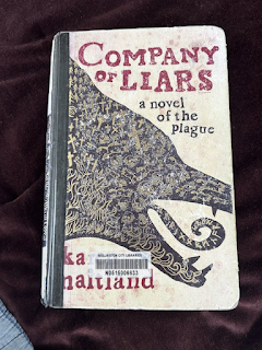
Read because recommended by a colleague.
As noted, books set in the medieval period have been a feature of the past few years' reading and this tale of a band of travellers in plague-struck England, each practicing their own deceptions, fits in there. Kind of like a good stew - chunky, with a satisfying set of ingredients.
% Roberto Piumini, Glowrushes, 1987 (recently translated from the Italian)
Read because picked up from a NYT review along with the Lois Lowry below
There’s an unprovable theory that the distinguishing line between writing for children and writing for adults is that writing aimed for children does not stray into the emotional realm that (typically) only adult experiences make accessible to us.
In that case, Piumini’s book, while centred on a child and very simply told, is not a children’s book, because if deals in the matter of adult transformation.
A king calls a painter to his palace, to decorate the rooms of his eleven year-old son, who has a deadly allergy to sunlight and air-borne dust. Together, the painter and the prince create three linked environments of mountains, sea and meadow. As the boy’s health fails the stories become ever deeper, and the shared love of him between the painter and the king ever more poignant.
Half-way through the book, I was thinking “No kid would ever want to read this, it’s boring”. At the end that didn’t matter. Not a book for kids, but a beautiful emotional experience nonetheless.
Read because I really enjoyed the first in this series, Hild - an imagining of the early life of the 7th century English saint, Hild of Whitby. (Did I mention the medieval thing?)
The depth of research outstrips the pace of the narrative at times, but you can feel how the author lives and breathes the character of Hild and the pain she endures in this novel.
Read because I have no idea why. Maybe it was on the recently-returned shelf at the library?
A cuttingly elegant little book that starts off as a satire of youth and morality, set in 1945 London between VE and VJ days at the May of Teck Club, a hostel for young women of in need of “Pecuniary Convenience and Social Protection”, and ends as a small tragedy. I've read a lot of mid-20th0century British women writers over the past few years (Claire Mabey has been a real reading inspiration in this space) and I rather love their style, all perfectly formed sentences and brutal emotional denouements. I was gratified to hear Patrick deWitt extoll their graces at the recent Writers Festival in Wellington.
Read because of an NYT review (above)
A totally unexpected master class in what it is to be a writer, exploring and crafting a story from hints of history.
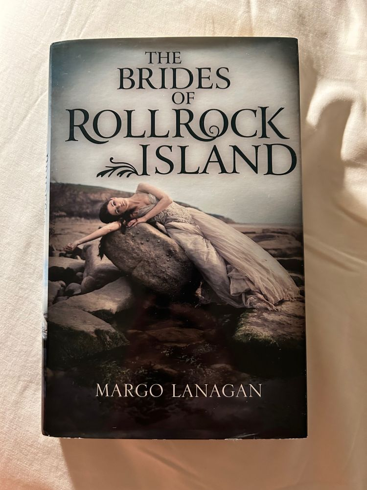
I love a good bog story (Margo Lanagan, Treacle Walker). When I read about this book — inspired by the Windeby Child, an Iron Age adolescent found by German peat-cutters in 1954 — I was immediately excited. I expected something immersive, folkloric, atmospheric, sad.
Instead, Lowry delivers a brilliant and generous explanation of what it is to be a writer, who picks up the bones (sorry) of an idea from history, and then crafts it into a narrative. She shares two interlocked stories about the Windeby Child, framed by a series of direct addresses to the reader, explaining what she is doing in each story, and why: what us or isn’t possible in each story, and how it makes her feel. The book lays open the process of writing and, tacitly, of reading. I can imagine if I were 11 or 12 I would be blown away by this laying bare of magic.
Interestingly, the first third of the book I was deeply resistant to this approach (I wanted that folkloric magic!). And then I was gripped, and impressed. And today I'm still thinking about it.
Read because Anna works with us at Te Papa, plus also keeping an eye on NZ writers.
I always feel dorky telling authors what I think about their books, but this is what I sent to Anna after finishing Bird Life:
Congratulations on your longlisting for the Ockhams. I was reflecting on this last night while reading your book. There are some absolute barnstormers on the list – Emily, Eleanor, Catherine. I was thinking about how gung-ho they all are – so pacey, and with some quite broad characterisation (in the case of Birnam Wood that feels satirical of course; Pet carries its recent-past research really lightly and with Lioness, it’s the cringey moments that bring the book into high definition for me). Bird Life is more like a watercolour – not in the sense of being delicate at all, but that it feels like there’s no room for mistakes. Every word, very evocation feels so carefully weighed and placed: like those stories you read about beautiful mosaics, where the tiny stones are laid just right, so as best to reflect the light.
Read because I was always going to, and because I got to interview Rachael about this at the Writers Festival in Wellington in Feb.
I'm working on a proper article about this. For now: what a satisfying book. It's eerier than I expected (King gets her love of folk-horror in here). Finishing it for the first time, I was struck by how comfortable some of the familiar forms of the storytelling are, and then how fresh other aspects of the book feel. There is a missing dad, for example - quite common in kids and YA lit - but there's also a closely described real-life setting, a detailed depiction of a South Island horse-trekking business. There's a love of words and the emergent power of language that if you're a "bookish" kid you respond to so strongly at this age - and there's also a thoughtful consideration of what it means to import a foreign mythology into an Aotearoa New Zealand landscape.
Read because the fact that it's a new Lydia Davis is reason enough.
I tweeted while I was reading this that Lydia Davis feels like memes for poetry lovers. I made the mistake of borrowing this from the library and trying to read it like a book. That's not how you should read Davis, you're meant to sip not skull.
% John Masefield, The Midnight Folk, 1927
Read because another book linked to The Dark is Rising on the Backlisted podcast, I think.
This was a conundrum. The Midnight Folk is a quest tale: a lonely little boy stuck on a country estate with his distant guardian and mean governess is sent on a treasure hunt, assisted by the night creatures, including Nibbin (the good cat) and Rollicum Bitem Lightfoot (the local fox). Some gorgeous set pieces and fancies are packed into a "narrative" that seems almost willfully wandering and obtuse. Would make a gorgeous animation.
Read because spotted on the shelves at Good Book Shop
A two hander, this one. The set-up and first half were a propulsive delight, perfect for a Netflix series, all spiky characters, hidden motives and back story. The second half though was overly convoluted and lost the fun pace.
# % Ann Scott-Moncrieff, Auntie Robbo, 1940
Read because I picked this up at Hatchards in London because the blurb was so appealing.
Ann Scott-Moncrieff died at just 29, leaving behind her author husband and three children. Her short writing career took place mostly over the Second World War. Auntie Robbo, rejected by her English publisher as “too Scottish” was then published in America but all the comp copies were lost when the ship they were traveling in was torpedoed in the Atlantic; most copies of an earlier book were destroyed when her publisher in London was bombed.
It's a truly delightful book. Auntie Robbo (81, energetic, hedonistic, “totally transparent” by which the author means completely obvious in her motives and her pleasures) and her orphaned great grand-nephew, 11 year-old Hector, are living a very contented life in their home Nethermuir, twelve miles out of Edinburgh. Their happiness is suddenly imperiled by the arrival of Hector’s long-forgotten stepmother Merlissa Benck, who lands upon the household and rapidly decides Auntie Robbie is mad as a hatter and Hector would be much better off at public school. So Auntie Robbo and Hector do a runner, launching themselves on a rollicking adventure in the Scottish highlands, picking up three extra (largely homeless - this was a really interesting detail, kind of like the Fossil sisters in Ballet Shoes or Sara in A Little Princess, an example of how often kid's lives were depicted as precarious in earlier children's lit) children and a tinker’s wagon along the way. Much food is eaten, scrapes squeaked through, weather endured, talents discovered and good sense expressed until we reach a happy ending with Miss Benck happily dealt to and Auntie Robbo and Hector’s happy way of life restored.
It’s like a much less cruel Roses Dahl, with an eccentric old lady who expects the world to confirm to her expectations and a gaggle of children who joyfully bob in her wake. The Scottish setting is lovely, and the scattering of Scottish words a pleasure. It sits in that genre of children's books where the key adult character, rather than enabling the action through their absence, enables it with their presence (see also The Explorer in Katherine Rundell's The Explorer below).
I do have to make a dash of racism warning. A great pity, because the book otherwise stands up so well.
Read because a Mantel I hadn't read! I have a policy of not being upset by the deaths of people I don't actually know, but I made a selfish exception for Mantel and A.S. Byatt, I would've liked both to have had another 50 years of writing life.
Vacant Possession is grimy, funny and malevolent. It feels like a blueprint for Beyond Black, one of my five favourite Mantels: it has all the sensuousness detail that makes the Wolf Hall series so seductive, but set in the grim environs of 1980s Britain. A wonderful black comedy.
Read because glowing review in the NY, I think.
A frictionless book. I’m interested that it’s received so much attention and praise. I think it’s very “American” — it’s a kind of examination of class which is actually of wealth. It runs on themes of risk, precarity and social manipulation but with a curiously distanced, numbed tone. Compulsively readable though, I very rarely achieve an “all in one sitting” but I polished this off on a Sunday morning. Reminded me of R.F. Kuang's Yellowface in that I felt a bit icky for swallowing it down so fast.
Read because I'll read anything by Rebecca Stead, When You Reach Me lives in my forever top 10 books.
Can you read too many children's books that hinge upon a burgeoning love of reading and writing and libraries? Perhaps. Nonetheless, this is a charmer. It's a mystery for middle-grade readers and while the "mysteries" become clear quite quickly, the gentle exploratory tone, the easy likability of the characters, the charm of the ghost story and the creation of Mortimer the cat - a great addition to the canon of animal narrators - make up for that. A good book to read as an adult if you're thinking about how children's books are constructed for their readers.
Brandon Sanderson, Tress of the Emerald Sea, 2023
Read because another recc from the Unity Books display.
I've never read Sanderson and I don't really know how he fits into the fantasy world. Tress is an obvious homage to The Princess Bride with touches of Neil Gaiman's Stardust and some Pratchetty punnery. Inventive, touching in places, a bit obvious. Having said that, at this time I needed something unchallenging and this fitted the bill.
Read because I don't devour Dicamillo instinctively but I read and listened to some wonderful interviews with her last year, and I did really enjoy her previous book, The Beatryce Prophecy.
This is the first of a projected trio of novellas, short contemporary fairytales. It is one of those deceptively deep little books, a beautiful piece of writing, sad and gratifying.
Read because Rundell is all the rage and her latest Impossible Creatures is still on my to-read stack, but I found this on the library shelf recently.
Rundell is immensely respected & popular as a children’s book author (this is only my second book of hers, following the bio of John Donne). I’ve heard her speaking on podcasts more than I’ve read her.
The book is charmingly old fashioned in some ways (four kids crash land in the Amazon, have to overcome their own fears and their uncertainties and assumptions about each other in order to survive & plan their escape). There is a mysterious and irascible adult who has to be compassionately unpacked. Rundell is very good at the animals of the Amazon — as friend, food and foe.
There are several heavily delivered themes in the book. There is “confront your fears, with kindness”. There is “colonial exploration is colonial exploitation”. There is “paying attention is a your duty to the vast and beautiful world”. There is “wizened hearts can be rehydrated”. There’s maybe a bit too much tell-not-show going on.
The writing though is wonderfully lucid, by which I mean it generally stays out of the way but is occasionally also quite beautiful. I did get a bit misty-eyed at the end though so you know — The Explorer definitely does the job.