Monday, 30 November 2009

Post-NDF thoughts

Best of 3 has been quiet for the past few weeks, mostly because I was pretty heavily involved with the National Digital Forum, where people from galleries, museums, archives, libraries, universities, polytechs and much more come together to talk about New Zealand's cultural heritage in the digital world.

The highlight of the conference presentations for me was, without a doubt, Daniel Incandela's keynote lecture. Some of his points that really resonated with me were:
  • Technology needs to reflect a personality
  • It's okay for content to step outside your comfort zone
  • It's okay to take risks
Another presentation that really hit a chord with me was Andy Neale from DigitalNZ, talking another the increasing cross-over and blurring between the physical and digital world, and physical and digital things. Today something - an object, a poem, a sentence spoken aloud - can have many manifestations, and be seen and used in many ways.

Julie Starr, journalist, blogger, and editor-in-residence at Wintec's school of media arts, has written a really interesting post on her Evolving Newsroom blog, looking at the similarities between issues and topics discussed at NDF, and issues and concerns around contemporary digital news media. In the post she concentrates on copyright, findability, digital and visual literacy, and the need to 'connect all the dots' (a big theme of the conference).

Talking with Julie after the conference, and mulling over things Daniel and Andy had said, it began to occur to me that collecting institutions who are describing and digitising their collections are increasingly moving into the position of publishers - not just in the sense of making books, or searchable online collections, but in terms of being able to reuse content for many different purposes, with different editorial voices being expressed and audiences being catered to.

Mash this up with emerging tools like Ziln, ArtBabble and Newspaper Club, and what might the opportunities be for collecting institutions to take risks, push content into new places, and give audiences a better sense of their personalities?

Thursday, 19 November 2009

Career switch

It would be so easy to just poke fun, or dismiss this as a publicity stunt. But you know what? The sun's shining, I'm feeling generous, and I'm going to say that maybe Shaquille O'Neale has a genuine interest in art and his co-curation of a show for the Flag Art Foundation is a mutually enjoyable and beneficial enterprise.

Titled 'Size Does Matter', the show has a line up of artists who I wouldn't kick out of the gallery for eating crackers, including Maurizio Cattelan, Chuck Close, Andreas Gursky, Jeff Koons and - of course - a big naked guy from Ron Mueck (on loan from the Hirshhorn). In an icing-on-the-PR-cake move, the catalogue features an essay by (in)famous author James Frey.

I now predict the race is on between Christchurch Art Gallery and Auckland Art Gallery to follow this up: most likely candidate being, naturally, Anton Oliver.

Tuesday, 17 November 2009

Web muster

1.
More on the visualisation theme: Pick-a-Path books. I reckon these publications are a powerful metaphor for art history and especially collection hangs (witness Alfred Barr), I just have to make a snazzy presentation one day to sell the idea to someone.

2.
Two 'controversies' (the quote marks indicate I'm unsure about the validity of the outcry) that keep on giving: Damien Hirst's latest work (Guardian interview), and the Dakis Joannou show at New York's New Museum (NYT article 1: naughty museum | Jerry Saltz 1 | round-up of Tyler Green posts & thoughts | NYT article 2: incestuous museum | Jerry Saltz 2 )

3.
The sentence that has made my week (and it's only Tuesday):
Students will have attained ... 'Understanding of the specific concerns and needs of the high-net-worth client who is an art collector, enabling the student to build a stronger relationship with the client.' (New York University's Certificate in art business)

Friday, 13 November 2009

Let me be your fan (Part 1,000,000)

Yesterday I went along to the first day of the Engage Your Community conference (this afternoon I'm delivering a 3-hour workshop on using social media as part of the conference: my slides & resources are available here but you'd need to be at the workshop for the really juicy bits).

Many of the speaker touched on themes I harp on about a lot: Colin Jackson noted that the Internet has always attracted and fostered community; Chris Brown argued that social rules and mores are as important online as off; Nathalie Hofsteede talked about the web and transparency, and how it can work for you or against you. It was really interesting though to hear the issues, strategies and experiences I live and work with discussed through the lens of another sector.

Andrea Walker is the Online Communications Manager at Oxfam NZ. In her presentation she talked about Oxfam's experience of using social media sites, focusing on Facebook and Twitter.
One of the stories she told was about their Twitter account.

When the Twitter account was launched, Oxfam mostly focused on ways to drawn attention to our spread their key messages. Then one night the partner of one of the team came along to team drinks, and said that he thought the stream was good, but he'd like to know more about what's happening in the office. He thought he'd find this interesting.

Now Oxfam does tweet about workplace stuff - like birthday cake - in a way that still subtly draws attention to key messages (birthday cake made with fairtrade ingredients). It adds personality to their stream - it brings out the real people behind the brand, and it encourages real, human connection.

I enjoyed Andrea's presentation, and I was really glad she made this point. It matches with a point I feel like I keep banging on and on about - that people *want* to be your fans.

As an example; I've recently become a little bit obsessed with Berg's weeknotes blog posts. Berg is a London design consultancy who do things that are, frankly, a little magical and (often) a bit beyond me. [Tangent: Berg's work reminds me of Clarke's third law: Any sufficiently advanced technology is indistinguishable from magic only it's not just technology, it's the thinking and the way they communicate those thoughts]

Back on track. The weeknotes posts are recaps of what everyone in the office is doing. For example:

I’m liaising with builders to get quotes for the conversion of the new studio space, with accountants to answer queries on the year end and move to better book-keeping software, and researchers for: Ashdown; Silicon Roundabout; cybernetics. There are two contracts to chase and two proposals to complete. I know I say this every three months or so, but I’m busier and more productive than I’ve ever been.

I love this kind of detail. It's a little irrational (I'll never work with these guys) but I do. The same could be said for Stamen. I guess the nub of this is: I'm interested in their work, and they give me stuff to be interested in - not just the final ready-to-ship product or campaign, but the human side, the stuff that explains what they do and how they do it. The stuff that makes me feel involved.

Why can't more museums and galleries do this? Some people would doubtless argue that they're to busy working to blog or tweet about it. To which I'd ask: are you really too busy to engage with the people who you're working for?
Tuesday, 10 November 2009

Web muster

Starkwhite reports on charity art auction fatigue, and comes up with some good alternatives. I imagine being hit up by people all the time for donations must get on artists' nerves, and wouldn't exactly thrill their dealers either.

Over the net sticks with the table tennis motif, announces opening of the On the table exhibition space on 19 November.

The Collections Australia Network is running a careers seminar for people interested in the Australian museum/gallery industry - I wonder if this would work in NZ? I wonder what speakers would say? I wonder if there are enough new jobs in the sector each year to warrant it?

The annual Science Communicators Association NZ conference wrapped up yesterday, and I wish I'd been there. Hopefully, with the Humanities Council moving over to the Royal Society (with its terrific Science Media Centre) we might see things like the Aussie's Transformations in Cultural and Scientific Communication Conference happening over here. In fact, given that sometimes the only way to make something happen is to work on it yourself, I might add that to my 2010 'things to explore' list ....

Monday, 9 November 2009

Visualise this

Sometimes I look at the line-up of blog posts in my feedreader and just think shoot, there are some frigging clever people out there.

Among these are several designers/design companies who I've started following relatively recently thatspecialise in data visualisation, including David McCandless's 'Information is Beautiful' and the amazing people at Berg.

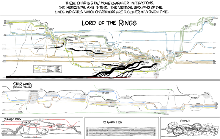
Over the past week, xkcd's visualisations of character interactions have been doing the rounds on the web (click here for the mega-full-size version, with Lord of the Rings galore)


This morning on my walk to work I was pondering some of the visualisations I'd like to see, relating to the New Zealand art world. Like:

The movements of a group of similarly-aged artists (e.g.Shane Cotton, Seraphine Pick, Michael Parekowhai and Peter Robinson) between dealers over the past 20 years.

A breakdown of the budgets for out 4 outings at the Venice Biennale (including the Trip of a Lifetime) including accommodation, meals, marketing, PR, materials, venue hire, flights, publications, photography; all measured against attendance and press coverage.

The distribution of McCahon works in public collections, measured in square centimetres.

Touring exhibitions of New Zealand art, showing relationships between originating and displaying institutions.

Friday, 6 November 2009

Putting the 'art' in Arts Festival

The visual arts have never (and when I say never, I mean "in my lived experience") been a strong feature of the New Zealand International Arts Festival. Sure, shows have coincided with the Festival, but there's not be a strong sense of planning.

The 2010 Festival looks like an exception, with:


While I'm most excited by Cardiff's The Forty-Part Motet, a work I've wanted to see/hear for years, I'm most impressed that the Dowse has scored the Viola work. This, combined with the recent pick-up in programming and exhibition design out in the Hutt, makes me wonder whether new director Cam McCracken might be making a play for the contemporary art crown that the City Gallery has held by default in recent years. Competition can only be good for us consumers.

Wednesday, 4 November 2009

See through


The Indianapolis Museum of Art's dashboard (a visualisation of all sorts of information about the IMA, from the current value of its endowment to its average daily electricity consumption) is now about two years old. Today Rob Stein, the IMA's Chief Information Officer, published a long post about museums and transparency on the IMA blog:

The concept of Transparency has received significant attention in the media and online recently. This attention comes at a time when public doubt in corporations, government and corporate executives is at an all-time high. High profile failures of some of the nation’s largest and most trusted institutions have shaken our assumptions about what had always seemed to be untouchable industries. Museums have always jealously guarded their trusted place in the public’s perception, but is there a risk that this trust will someday be lost? As caretakers of this trust, what is the best way to foster open communication about the challenges and opportunities that face us as we try to achieve the mission of our museums? As comprehensive and easy access to operational information becomes the norm, how can museums embrace this as an opportunity and confront internal fears about sharing their performance metrics with the public?

This is the first in a promised series of posts that I'm looking to following. I firmly believe that galleries and museums should be doing all they can to connect with their fans. Transparency is an important aspect of this.

Daniel Incandela, Director of New Media at the IMA, is the first speaker at this year's National Digital Forum (23-24 November, Wellington). There are still a handful of places left at the conference.

Tuesday, 3 November 2009

Two typos and a conference

1.

In a comment on yesterday's post, Duncan left a link to a 2003 lecture by designers Jessica Helfand & William Drenttel, 'Culture is not always popular'. As well as some periodic table eye-candy, Helfand and Drenttel were posing a pretty interesting question - but desingers need to understand the subject matter of what they're visually communicating?

2.

I have a big crush on typographers Hoefler & Frere-Jones, so you can imagine my (thankfully internal) shriek of girlish glee when I found them on Twitter

3.

Spaces are still open on next week's Engage Your Community conference & workshop day in Wellington. If you want a really good, astoundingly well-priced introduction to contemporary web communications, get in there fast.


Monday, 2 November 2009

Typeheads

Last night I finally got round to watching the Helvetica documentary, which marked the 50th anniversary of the creation of the Helvetica font by interviewing designers, typographers and design commentators, alongside footage showing how ubiquitous the arch-modernist font is in our urban environments.

I like fonts just fine. I would rate my caring as about 50% - midway between people who love using Comic Sans, and people who think people who love using Comic Sans should be lined up and shot.

The documentary reminded me how much I love listening to articulate people talk about a subject they love. In particular, it was a joy to hear Tobias Frere-Jones and Jonathan Hoefler talk about their design process: they use emotive or memory-inflected phrases when describing to each other what they're trying to achieve with a font, rather than talking about ascenders and descenders and chamfered edges.

For example, from their description of the creation of 'Tungsten':

A few years ago, we started wondering if there was a way to make a typeface in this genre that was disarming instead of brutish, one that employed confidence and subtlety instead of just raw testosterone. It was an unusual design brief for ourselves, completely without visual cues and trading in cultural associations instead: “more Steve McQueen than Steven Seagal,” reads one note; “whiskey highball, not a martini” suggests another.

Tungsten is a steel-grey metal with an extremely high melting point (second only to carbon), making it ideal for use in things like filaments in electric lightbulbs. I've recently re-read Oliver Sack's memoir of his chemical-mad childhood, Uncle Tungsten, so I was feeling ready to like the H & F-J font as soon as I saw the name. Then this morning I happened across New Zealand typographer Kris Sowersby's Karbon - which made me wonder if anyone has laid out typefaces into a periodic table-like display.

And of course someone has. Design and science geeks rejoice.