Tuesday, 22 December 2009

Last post

It's nice to end the year with a discovery rather than a summary. I was a late-comer to American photographer Alec Soth's blog; within months of falling for it, he stopped writing.

So I was delighted to find out this morning (via C-Monster) that Soth is blogging again, as part of Little Brown Mushroom Books.

From the site, here's Soth's Glass Jars

Glass Jars from Little Brown Mushroom on Vimeo.


Best of 3 is taking a Christmas break. See you in the second week of January.

Friday, 18 December 2009

Web Muster

I don't just admire London design firm Berg's work - I am totally in love with how they communicate their work. Check out this post & video on their digital magazine project.

Patronising the arts by Josh Silverstein, from McSweeney's.

The Daily Mail reports Hugh Grant was drunk when he instructed an assistant to bid on a Warhol Elizabeth Taylor at auction (which he won, and subsequently sold 6 years later for a healthy profit). The Guardian treats the story as a morality tale.

Information that's nearly beautiful - a graph of the number of negative reviews per art critic published in the NYT in 2009 is a niceidea, but the figures should be percentages.

And the New York Times asks whether arts institutions' rapid expansions in the past 10 years were the result of the economic bubble, which is now popping in their faces.

Thursday, 17 December 2009

Besties II

Best news

The Julian and Josie Robertson promised gift of 15 international artworks to Auckland Art Gallery.

Best new comms tool

Twitter is a top competitor for 2009 word-of-the-year. Christchurch Art Gallery, City Gallery Wellington, Auckland Museum and Te Papa's Collections Online twitter accounts are all run by people who give a damn about their audiences, and that's what makes them work.

Best read

New Zealand doesn't suffer from a lack of writing about art, but we do lack of analysis of the art sector and the way it does (and sometimes doesn't) function. David Marr's The Henson Case was published in October 2008 but as I didn't read it until this year, I'm counting it as 2009's best read: a lucid and considered, but pacey, account of the unfolding of the controversy surrounding Henson's photographs of a naked adolescent.

Wednesday, 16 December 2009

Director swop

The Guardian reports on Nicholas Serota, director of the Tate, doing a day swop with Rob Thomas, headmaster of Thomas Tallis school, a "specialist arts college in a deprived area of London that's just been christened a 'national school of creativity' by Arts Council England".

Which begs the question:

Tuesday, 15 December 2009

Besties I


et al, that's obvious! that's right! that's true!, Christchurch Art Gallery, 2009.
Photographer David Watkins. Photo from the et al website.


Best show

et al's that's obvious! that's right! that's true! at Christchurch Art Gallery. A brave piece of programming for the Gallery, and a triumph of a show.

Best comeback

Under new director Cam McCracken, the Dowse feels like a place to go to see art again. Unfortunately the Dowse website seems to have gone AWOL this morning, so you can read this old piece instead.

Best (new) (New Zealand) blog

Over the net is still reliably informative & entertaining, but this year's hat tip is to the Starkwhite blog, which moves beyond promoting the dealer gallery's shows & artists and into the wider issues of the New Zealand and international art world.

Monday, 14 December 2009

Big'n'beautiful

Writing in The Telegraph, Alastair Sooke identifies a return to beauty with Anish Kapoor's large show at the Royal Academy and Richard Wright's Turner prize-winning gold-leaf mural. Sooke sees the return to beauty merging as a reaction to the 'boorish antics' of Hirst, Emin et al. He also argues that in troubled time we seek things that are "luminous and orderly" - "There is a greater thirst for beauty than there has been in recent years, and this is the result of an increased appetite for art that offers an antidote to doom and gloom."

It appears to me though that part of the appeal of these works is sheer scale, and colour. It's often claimed that the punters don't like abstract art because it's "too hard". As with Yayoi Kusama at City Gallery Wellington, when abstract meets spectacle, you appear to have a winning combination.


Anish Kapoor, Royal Academy, London


Friday, 11 December 2009

Avoiding the obvious

One of the few reasons I regret not living in Auckland is that Michael Parekowhai doesn't have a Wellington dealer. So a recent trip north has timed to coincide with Parekowhai's new show at Michael Lett Gallery, The Moment of Cubism.


Michael Parekowhai, The Moment of Cubism - installation view, 2009, Michael Lett Gallery

Parekowhai has, since the outset, made incredibly interpretable work.


Michael Parekowhai, Kiss the baby good-bye (The Maquette), c. 1994, Christchurch Art Gallery

As with Shane Cotton, writers and art historians have delighted in unpacking and unravelling all the signifiers in the works, in a kind of cryptic crossword fashion. This has certainly held true with John Hurrell's review of 'The Moment of Cubism' (and subsequent reader comments).

What I admire about Parekowhai - and what keeps me intrigued - is the distance he places between himself and the interpretation of his work. Sometimes it almost seems he's taunting the interpretors with traps baited with art historical quotations and cultural references - although this implies more time and effort being devoted to the cause than I imagine really is.

The themes that to my mind reoccur across Parekowhai's works are:

  • immaculate construction
  • puzzling yet awesome titles
  • experiments with scale
  • realism (often subverted)
  • art-historical/cultural references (I'm as fallible as everyone else, you know)

When you look at the body of work in this way, objects as disparate as taxidermied sparrows and up-sized Wedgewood bookends hook together in a way that makes you hunger for a survey show.

Thinking about The Moment of Cubism, the first of Parekowhai's works that came to mind was My Sister, My Self (coincidentally, part of the last show Parekowhai had at Michael Lett's, in June 2007 - it's been a while between drinks).


Michael Parekowhai, My Sister, My Self, 2006, Christchurch Art Gallery

The Moment of Cubism shares the blow-it-up-big approach to domestic tchotchkes. But the next set of work I thought of was The Consolation of Philosophy, the photographic series from 2001.


Michael Parekowhai, Boulogne, 2001, Michael Lett Gallery

Part of this is purely aesthetic, of course; the creamy tints of the elephants and the deer sculptures in The Moment of Cubism calling to mind the Crown Lynn vases in The Consolation of Philosophy. The Consolation of Philosophy is relatively easy to 'read' (flower arrangements named after major engagements in which the Maori Battalion fought in WWII) - but only once you've been given that information. Like the pieces in The Moment of Cubism, the photographs hold themselves aloof.

The Moment of Cubism comprises two new pieces of work - the cast bronze lemon trees and palette and Te Ao Hurihuri, the elephant sculptures - and a piece shown earlier this year at Roslyn Oxley's, Seldom is Herd (punniest MP title yet?). In Sydney, Seldom is Herd was accompanied by The Brothers Grimm - ten little 'Indian' boys.


Michael Parekowhai, Seldom is Herd (installation view), 2009, Roslyn Oxley9 Gallery

Ten little Indians refers back to a counting song for small kids, and it suddenly occurred to me as I was looking through these images that this is a connection back to the Atarangi works, based on Cuisenaire rods, used to teach children about relationships between numbers and more recently employed as a tool for teaching te reo.


Michael Parekowhai, Atarangi II, 2005, Te Tuhi

According to the Roslyn Oxley press release, the little Indians are modelled on Parekowhai's sons. If I recall correctly, these kids have played Indians before - in Steve Carr's 2004 film, Cowboys and Indians. [Or do I have this completely wrong?]

Anyway. Michael Parekowhai is a smart smart guy, and he likes to fool around with us viewers. Relax and enjoy it. If this show doesn't put him into the next Walters Prize, I'll be a donkey's uncle. Go see it (on til 23 January 2010)

Thursday, 10 December 2009

tribal fundraising

I've been meaning to get this down from week now, since hearing Chris Brown speak at the Engage Your Community conference.

The abstract for Brown's presentation didn't really sum up what he spoke about. Brown is director of brand & PR firm Sputnik and co-author with Jill Caldwell of 8 Tribes: The Hidden Classes of New Zealand, a "values-based social anthropology of New Zealanders".

The 8 Tribes analysis breaks New Zealanders down into eight groupings, based on the values they espouse and lifestyle they lead:

The North Shore tribe
The Grey Lynn tribe
The Balclutha tribe
The Otara tribe
The Remuera tribe
The Raglan tribe
The Cuba Street tribe
The Papatoetoe tribe

You can do an online survey to establish your own tribe (in the interests of transparency, I'm half Grey Lynn and half Balclutha)

Now, before you start yelling at me about insensitive stereotypes and pseudo-social-sciences, it's not my book, and it's certainly not The Book.

What it is though is an interesting way for galleries to look at the audiences they wish to engage when they're on a fund-raising drive. This was the best bit of Brown's EYC presentation.

For example. The North Shore tribe are the "ambitious, hard-working, heavily-mortgaged inhabitants of the great suburban jungle". For them, "looking good and keeping up appearances" are really important. This is your audience for black tie celebrity auctions.

Or the Balclutha tribe: "the tribe of the Kiwi heartland, the provincial conservatives, who see themselves as a source of stability and commonsense, bearers of on-going connection with the land – solid, reliable and down to earth, but also deceptively smart". Will lend time and expertise (get them along for a working bee, or help with your accounts) but unlikely to throw cash your way.

Or the Grey Lynn tribe (I reckon this is your hard-core art patron grouping). They're the "highly educated intelligentsia who value ideas above material things and intellectualise every element of their lives." They "prefer to be “challenged” than entertained, seek out authentic experiences". Give them access to important intellectual figures (visiting curators/writers/critics) and artists (not that I'm saying that artists can't fall into the 'intellectual figures' category)

Of course this is just one way of looking at your engagement and fund-raising activities. But a little analysis never hurt anyone. Check out this blog post on the application of 8 Tribes thinking to green politics.

Wednesday, 2 December 2009

Searching

Earlier this year, I (re)read Neal Stephenson's Baroque Cycle. Stephenson piqued my interest in the early history of the Royal Society, and I followed up with Richard Holmes' hugely enjoyable Age of Wonder, James Gleick's biography of Newton, and am currently a couple of chapters into Lisa Jardine's Ingenious Pursuits - like Holmes' book, a history of mid-17th to mid-18th century science and invention told through the stories of the people who made them.

There's a romance to the period that I find irresistible: the way that the natural world seemed to unfold its mysteries at this time, the way literature and art and science and politics all intertwined, and the colourful characters who took personal and social risks to chase their dreams.

So when I saw yesterday in the Guardian that the Royal Society has released 'Trailblazing', an online library of its papers, to celebrate its 350th anniversary, I was stoked. Then I hit the site.

The (Flash) interface is designed as an interactive timeline - you pull it along, and hovering over little grey and red dots brings up pop-ups that contain a heading and a picture. Clicking 'More' gives you a small narrative about an article from the Royal Society's Transactions, and some links - one of which will take you to a PDF of the actual article, on another site.


The Guardian article notes:

There is the letter from the chemist Robert Boyle, asking the physician Richard Lower about the consequences of transfusing blood from one animal into another. Does a dog lose its quirks after transfusion and gain those of the donor? Does blood from a big dog make a small dog grow? Can you safely replace a frog's blood with blood from a calf, and might that change one species into another? The answers were no, no, no and no.

But how do I find it? Trailblazing doesn't have a search box. And if I did happen to find something I wanted to share, through clicking somewhat random red dots, there's no way of linking to it.

I understand the urge to build something 'interactive', although I'd argue that 'interactive' nowadays means being able to personalise a site to your tastes, or add your own information, not click and drag. And I understand the urge to give a browsable interface to what can be quite impenetrable texts. But I don't think Trailblazing makes as good a use of the awesome content as they could. Why not (a) use the people who made the science as your entrance points, rather than dates (b) make the deep content searchable along with the new narratives and (c) combine the two sites into one?

Tuesday, 1 December 2009

All about the story

In yesterday's post I mentioned journalist and blogger Julie Starr, which reminded me that I've been meaning to post about a new venture Julie is involved in - AllAboutTheStory.com

AllAboutTheStory is a marketplace for writers and publishers. Writers upload news features, stories, opinion pieces etc, and put a price on their text. Buyers can then browse the site to find pieces for publication. The site has cannily been launched in the lead-up to the slow part of the news year, giving editors a place to find interesting copy to fill the summer break.

The business model sees AllAboutTheStory taking a percentage from the sellers whenever an article is sold. Idealog has already signed up to the site.

At the moment, stories on offer cluster around technology and business. I'm interested to see whether any art writers take up this offer & start populating the Entertainment section (and setting their own value on their effort).

Monday, 30 November 2009

Post-NDF thoughts

Best of 3 has been quiet for the past few weeks, mostly because I was pretty heavily involved with the National Digital Forum, where people from galleries, museums, archives, libraries, universities, polytechs and much more come together to talk about New Zealand's cultural heritage in the digital world.

The highlight of the conference presentations for me was, without a doubt, Daniel Incandela's keynote lecture. Some of his points that really resonated with me were:
  • Technology needs to reflect a personality
  • It's okay for content to step outside your comfort zone
  • It's okay to take risks
Another presentation that really hit a chord with me was Andy Neale from DigitalNZ, talking another the increasing cross-over and blurring between the physical and digital world, and physical and digital things. Today something - an object, a poem, a sentence spoken aloud - can have many manifestations, and be seen and used in many ways.

Julie Starr, journalist, blogger, and editor-in-residence at Wintec's school of media arts, has written a really interesting post on her Evolving Newsroom blog, looking at the similarities between issues and topics discussed at NDF, and issues and concerns around contemporary digital news media. In the post she concentrates on copyright, findability, digital and visual literacy, and the need to 'connect all the dots' (a big theme of the conference).

Talking with Julie after the conference, and mulling over things Daniel and Andy had said, it began to occur to me that collecting institutions who are describing and digitising their collections are increasingly moving into the position of publishers - not just in the sense of making books, or searchable online collections, but in terms of being able to reuse content for many different purposes, with different editorial voices being expressed and audiences being catered to.

Mash this up with emerging tools like Ziln, ArtBabble and Newspaper Club, and what might the opportunities be for collecting institutions to take risks, push content into new places, and give audiences a better sense of their personalities?

Thursday, 19 November 2009

Career switch

It would be so easy to just poke fun, or dismiss this as a publicity stunt. But you know what? The sun's shining, I'm feeling generous, and I'm going to say that maybe Shaquille O'Neale has a genuine interest in art and his co-curation of a show for the Flag Art Foundation is a mutually enjoyable and beneficial enterprise.

Titled 'Size Does Matter', the show has a line up of artists who I wouldn't kick out of the gallery for eating crackers, including Maurizio Cattelan, Chuck Close, Andreas Gursky, Jeff Koons and - of course - a big naked guy from Ron Mueck (on loan from the Hirshhorn). In an icing-on-the-PR-cake move, the catalogue features an essay by (in)famous author James Frey.

I now predict the race is on between Christchurch Art Gallery and Auckland Art Gallery to follow this up: most likely candidate being, naturally, Anton Oliver.

Tuesday, 17 November 2009

Web muster

1.
More on the visualisation theme: Pick-a-Path books. I reckon these publications are a powerful metaphor for art history and especially collection hangs (witness Alfred Barr), I just have to make a snazzy presentation one day to sell the idea to someone.

2.
Two 'controversies' (the quote marks indicate I'm unsure about the validity of the outcry) that keep on giving: Damien Hirst's latest work (Guardian interview), and the Dakis Joannou show at New York's New Museum (NYT article 1: naughty museum | Jerry Saltz 1 | round-up of Tyler Green posts & thoughts | NYT article 2: incestuous museum | Jerry Saltz 2 )

3.
The sentence that has made my week (and it's only Tuesday):
Students will have attained ... 'Understanding of the specific concerns and needs of the high-net-worth client who is an art collector, enabling the student to build a stronger relationship with the client.' (New York University's Certificate in art business)

Friday, 13 November 2009

Let me be your fan (Part 1,000,000)

Yesterday I went along to the first day of the Engage Your Community conference (this afternoon I'm delivering a 3-hour workshop on using social media as part of the conference: my slides & resources are available here but you'd need to be at the workshop for the really juicy bits).

Many of the speaker touched on themes I harp on about a lot: Colin Jackson noted that the Internet has always attracted and fostered community; Chris Brown argued that social rules and mores are as important online as off; Nathalie Hofsteede talked about the web and transparency, and how it can work for you or against you. It was really interesting though to hear the issues, strategies and experiences I live and work with discussed through the lens of another sector.

Andrea Walker is the Online Communications Manager at Oxfam NZ. In her presentation she talked about Oxfam's experience of using social media sites, focusing on Facebook and Twitter.
One of the stories she told was about their Twitter account.

When the Twitter account was launched, Oxfam mostly focused on ways to drawn attention to our spread their key messages. Then one night the partner of one of the team came along to team drinks, and said that he thought the stream was good, but he'd like to know more about what's happening in the office. He thought he'd find this interesting.

Now Oxfam does tweet about workplace stuff - like birthday cake - in a way that still subtly draws attention to key messages (birthday cake made with fairtrade ingredients). It adds personality to their stream - it brings out the real people behind the brand, and it encourages real, human connection.

I enjoyed Andrea's presentation, and I was really glad she made this point. It matches with a point I feel like I keep banging on and on about - that people *want* to be your fans.

As an example; I've recently become a little bit obsessed with Berg's weeknotes blog posts. Berg is a London design consultancy who do things that are, frankly, a little magical and (often) a bit beyond me. [Tangent: Berg's work reminds me of Clarke's third law: Any sufficiently advanced technology is indistinguishable from magic only it's not just technology, it's the thinking and the way they communicate those thoughts]

Back on track. The weeknotes posts are recaps of what everyone in the office is doing. For example:

I’m liaising with builders to get quotes for the conversion of the new studio space, with accountants to answer queries on the year end and move to better book-keeping software, and researchers for: Ashdown; Silicon Roundabout; cybernetics. There are two contracts to chase and two proposals to complete. I know I say this every three months or so, but I’m busier and more productive than I’ve ever been.

I love this kind of detail. It's a little irrational (I'll never work with these guys) but I do. The same could be said for Stamen. I guess the nub of this is: I'm interested in their work, and they give me stuff to be interested in - not just the final ready-to-ship product or campaign, but the human side, the stuff that explains what they do and how they do it. The stuff that makes me feel involved.

Why can't more museums and galleries do this? Some people would doubtless argue that they're to busy working to blog or tweet about it. To which I'd ask: are you really too busy to engage with the people who you're working for?

Tuesday, 10 November 2009

Web muster

Starkwhite reports on charity art auction fatigue, and comes up with some good alternatives. I imagine being hit up by people all the time for donations must get on artists' nerves, and wouldn't exactly thrill their dealers either.

Over the net sticks with the table tennis motif, announces opening of the On the table exhibition space on 19 November.

The Collections Australia Network is running a careers seminar for people interested in the Australian museum/gallery industry - I wonder if this would work in NZ? I wonder what speakers would say? I wonder if there are enough new jobs in the sector each year to warrant it?

The annual Science Communicators Association NZ conference wrapped up yesterday, and I wish I'd been there. Hopefully, with the Humanities Council moving over to the Royal Society (with its terrific Science Media Centre) we might see things like the Aussie's Transformations in Cultural and Scientific Communication Conference happening over here. In fact, given that sometimes the only way to make something happen is to work on it yourself, I might add that to my 2010 'things to explore' list ....

Monday, 9 November 2009

Visualise this

Sometimes I look at the line-up of blog posts in my feedreader and just think shoot, there are some frigging clever people out there.

Among these are several designers/design companies who I've started following relatively recently thatspecialise in data visualisation, including David McCandless's 'Information is Beautiful' and the amazing people at Berg.

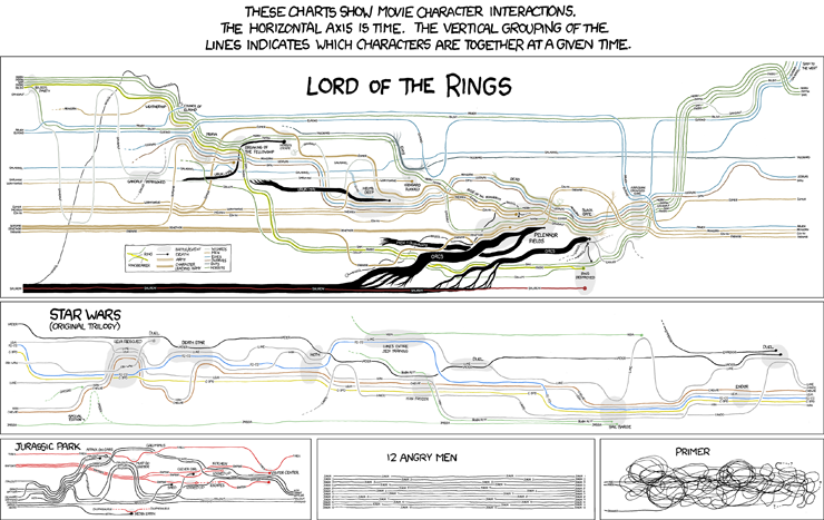
Over the past week, xkcd's visualisations of character interactions have been doing the rounds on the web (click here for the mega-full-size version, with Lord of the Rings galore)


This morning on my walk to work I was pondering some of the visualisations I'd like to see, relating to the New Zealand art world. Like:

The movements of a group of similarly-aged artists (e.g.Shane Cotton, Seraphine Pick, Michael Parekowhai and Peter Robinson) between dealers over the past 20 years.

A breakdown of the budgets for out 4 outings at the Venice Biennale (including the Trip of a Lifetime) including accommodation, meals, marketing, PR, materials, venue hire, flights, publications, photography; all measured against attendance and press coverage.

The distribution of McCahon works in public collections, measured in square centimetres.

Touring exhibitions of New Zealand art, showing relationships between originating and displaying institutions.

Friday, 6 November 2009

Putting the 'art' in Arts Festival

The visual arts have never (and when I say never, I mean "in my lived experience") been a strong feature of the New Zealand International Arts Festival. Sure, shows have coincided with the Festival, but there's not be a strong sense of planning.

The 2010 Festival looks like an exception, with:


While I'm most excited by Cardiff's The Forty-Part Motet, a work I've wanted to see/hear for years, I'm most impressed that the Dowse has scored the Viola work. This, combined with the recent pick-up in programming and exhibition design out in the Hutt, makes me wonder whether new director Cam McCracken might be making a play for the contemporary art crown that the City Gallery has held by default in recent years. Competition can only be good for us consumers.

Wednesday, 4 November 2009

See through


The Indianapolis Museum of Art's dashboard (a visualisation of all sorts of information about the IMA, from the current value of its endowment to its average daily electricity consumption) is now about two years old. Today Rob Stein, the IMA's Chief Information Officer, published a long post about museums and transparency on the IMA blog:

The concept of Transparency has received significant attention in the media and online recently. This attention comes at a time when public doubt in corporations, government and corporate executives is at an all-time high. High profile failures of some of the nation’s largest and most trusted institutions have shaken our assumptions about what had always seemed to be untouchable industries. Museums have always jealously guarded their trusted place in the public’s perception, but is there a risk that this trust will someday be lost? As caretakers of this trust, what is the best way to foster open communication about the challenges and opportunities that face us as we try to achieve the mission of our museums? As comprehensive and easy access to operational information becomes the norm, how can museums embrace this as an opportunity and confront internal fears about sharing their performance metrics with the public?

This is the first in a promised series of posts that I'm looking to following. I firmly believe that galleries and museums should be doing all they can to connect with their fans. Transparency is an important aspect of this.

Daniel Incandela, Director of New Media at the IMA, is the first speaker at this year's National Digital Forum (23-24 November, Wellington). There are still a handful of places left at the conference.

Tuesday, 3 November 2009

Two typos and a conference

1.

In a comment on yesterday's post, Duncan left a link to a 2003 lecture by designers Jessica Helfand & William Drenttel, 'Culture is not always popular'. As well as some periodic table eye-candy, Helfand and Drenttel were posing a pretty interesting question - but desingers need to understand the subject matter of what they're visually communicating?

2.

I have a big crush on typographers Hoefler & Frere-Jones, so you can imagine my (thankfully internal) shriek of girlish glee when I found them on Twitter

3.

Spaces are still open on next week's Engage Your Community conference & workshop day in Wellington. If you want a really good, astoundingly well-priced introduction to contemporary web communications, get in there fast.


Monday, 2 November 2009

Typeheads

Last night I finally got round to watching the Helvetica documentary, which marked the 50th anniversary of the creation of the Helvetica font by interviewing designers, typographers and design commentators, alongside footage showing how ubiquitous the arch-modernist font is in our urban environments.

I like fonts just fine. I would rate my caring as about 50% - midway between people who love using Comic Sans, and people who think people who love using Comic Sans should be lined up and shot.

The documentary reminded me how much I love listening to articulate people talk about a subject they love. In particular, it was a joy to hear Tobias Frere-Jones and Jonathan Hoefler talk about their design process: they use emotive or memory-inflected phrases when describing to each other what they're trying to achieve with a font, rather than talking about ascenders and descenders and chamfered edges.

For example, from their description of the creation of 'Tungsten':

A few years ago, we started wondering if there was a way to make a typeface in this genre that was disarming instead of brutish, one that employed confidence and subtlety instead of just raw testosterone. It was an unusual design brief for ourselves, completely without visual cues and trading in cultural associations instead: “more Steve McQueen than Steven Seagal,” reads one note; “whiskey highball, not a martini” suggests another.

Tungsten is a steel-grey metal with an extremely high melting point (second only to carbon), making it ideal for use in things like filaments in electric lightbulbs. I've recently re-read Oliver Sack's memoir of his chemical-mad childhood, Uncle Tungsten, so I was feeling ready to like the H & F-J font as soon as I saw the name. Then this morning I happened across New Zealand typographer Kris Sowersby's Karbon - which made me wonder if anyone has laid out typefaces into a periodic table-like display.

And of course someone has. Design and science geeks rejoice.

Thursday, 29 October 2009

Take a punt

and try something different today:

Mob Rule! How Users Took Over Twitter
by Steven Levy

It’s easy to write off Twitter as a happy accident, a right-place, right-time fluke. But that misses the point. When Twitter’s creators designed the service, they made a series of crucial and deliberate decisions — ones that seem brilliant in retrospect — that created the conditions that allow users to innovate.

What Startups Are Really Like by Paul Graham

9. Engage Users

Product development is a conversation with the user that doesn't really start till you launch. Before you launch, you're like a police artist before he's shown the first version of his sketch to the witness.

It's so important to launch fast that it may be better to think of your initial version not as a product, but as a trick for getting users to start talking to you.

Tuesday, 27 October 2009

Web muster

Just over 900 of Vincent van Gogh's letters have been digitised and put online in Vincent van Gogh: The Letters. A digital accompaniment to a print publication, the letters are fully transcribed, translated and searchable.

The strongest feature of the site is that way that you can view a single letter in multiple ways - an image of a page, the transcription, the original line breaks, the English translation, the editors' notes, and related works. You can also easily compare and contrast, as shown below.


There are amazingly detailed notes about the publication (down to the insertion of missing commas) and some solid info about the technology behind the site.

And in other web news: changes to the display of MoMA's permanent collection (including frame removal).

Friday, 23 October 2009

2 down, 1 to go

The Art & Industry Trust has announced changes for the next SCAPE Biennial in Christchurch, stating that "SCAPE 2010 will offer fewer pieces, selected against different criteria and a different process. More than two-thirds of the artworks will be from New Zealand artists, with a number of projects targeting the wider community for involvement." A curatorial group has been established, with three members: convenor Blair French, artist Julia Morison and landscape architect William Field.

Meanwhile, artists have been announced for next year's Auckland Triennial: Starkwhite's blog has the details.

That just leaves us waiting for an announcement from City Gallery about whether Prospect (the not-quite-biennial) will be taking place next year.

Thursday, 22 October 2009

Gem

The 1956 letter from American artists to James Johnson Sweeney, protesting Frank Lloyd Wright's curved-wall design for the Guggenheim:

The basic concept of curvilinear slope for presentation of painting and sculpture indicates a callous disregard for the fundamental rectilinear frame of reference necessary for the adequate visual contemplation of works of art


Tuesday, 20 October 2009

Engage your community

The Engage Your Community conference in Wellington on 12-13 November looks like a perfect two-day immersion for people in arts organisations who are interested in using the web to connect with their audiences. (And I'm not just saying that because I'm running one of the workshops on the second day.)

The conference is being organised by Mike Brown, one of the people behind the renowned yearly Webstock event, and co-Webstocker Natasha Lampard ( ex-Head of Usability at Trade Me) is presenting on improving websites by putting user first. EYC might not have the glitzy international stars, but it's still one helluva line-up. Check out the full programme here.

Just as importantly, it's remarkably affordable. The first (conference) day is $150, and the half-day workshops are $175. There are good discounts for multiple attendees from one organisation, and for attendance at both days.

Thinking of Michael Stevenson


Reference Number: Eph-A-WAR-WII-1939-01
Alexander Turnbull Library, Wellington.

Monday, 19 October 2009

Oh, how punny!

It's an interesting name*, and an even more interesting business model. New Asshole is an online visual arts journal coming out of Philadelphia. You can download issues as PDFs for free, but the editors have put a Donate Now! Paypal button on the site with a suggested donation of $1-5 to help support the magazine.

This is a little like This American Life soliciting donations to support the broadband that makes their (extremely popular) free podcasts available. Small acts of philanthropy might be the future ....


*and quite an awesome pun for their blog - New RSShole

Friday, 16 October 2009

Web muster

Today I'm:

Tuesday, 13 October 2009

History

On a recent internet-less stint in New Plymouth I made several visits to the central library to get connectivity hits via the free wireless provided by the Aotearoa People's Network Kaharoa.

When I was a kid, my mum used to take us to the library every Friday after school. Every Friday I'd max my library card out to its limit, filling the sports bag I'd take along, then going home and shuffling the books into tall anticipatory piles on top of the piano.

Visits to the Taranaki Museum were another regular, but less fondly recalled, aspect of my New Plymouth childhood. I can remember being absolutely terrified of the education person, who I remember - fairly or unfairly - as a total harpy.

Things have changed now, of course. Instead of the separate library and museum, New Plymouth has the integrated - and all all accounts hugely successful - Puke Ariki. On my visits to the library, I couldn't get over the roving groups of teenagers, and the number of people who clearly treat the cafe and quieter spaces as extension of their workplace.

I also went along to see Fixated: Photography through history at the museum. I have to admit to being put off by the heavily designed permanent exhibitions when Puke Ariki opened - a too faithful approximation of early Te Papa, and the sense that staff felt collection objects couldn't stand on their own, but required bucket-loads of exhibition furniture to make them interesting.


Fixated however is a different story. I think its major achievement is how well it reads on multiple levels. It presents two intertwined histories - the history of the European settlement of Taranaki and the growth and change of the province, and the history of photographic processes - and all without getting in the way of just looking at the photos as objects.

Curator Ruth Harvey says in the exhibition blurb

I chose the word 'fixated' because of the Taranaki community's huge interest in photography – people are 'fixated' with it. The community has had a long history with the medium – Taranaki subjects feature in some of the earliest photography known in New Zealand.

People certainly were fixated - like the library, the place was heaving with people of all ages when I visited (a week day in the school holidays).

The exhibition gently mixes in contemporary work with historical photos, whether it's Ben Cauchi with his old-fashioned processes, or Peter Peryer with his recent digital photography. While Bill Culbert's light work (a recent Govett-Brewster acquisition) worked in the show, and tested the limits, I couldn't quite figure out what the Elizabeth Thomson sculpture was doing there. Generally though, 'fine art' sits reasonably comfortably alongside personal, documentary, commercial and social history photography.


One of the most lovable aspects of the show is the evident care and thought that has gone into mounting negatives, photographic equipment, and other bits and pieces in the vitrines, with their ingenious little props, undercuts and lighting features. In general, the presentation was spot on, especially the inclusion of a caravan-like mobile studio, although I wasn't that keen on the label design (YMMV) and there's a bit of weirdity with the placement of the labels on a long wall of double-hung framed images.

I think what I really like about the show is that it carries itself lightly. You can take in as much of either of the histories as you like, or as little. There is a rare balance of objects and interpretation: you can read everything, or you can ignore all the didactic material. It closes on 26 October, and I thoroughly recommend you get along there if you can.

Images by Keryn Baker, from the Puke Ariki website.

Friday, 9 October 2009

Blargh

I just tried to post this comment on John Hurrell's piece on the new Len Lye book on eyecontact, but Blogger's not accepting comments for him right now.

So here it is:

Boy, do I try to resist jumping in on things like this. But ...

It's great to have more scholarship on Lye out there, and a pretty book is a joy to behold and a lovely thing to put on the bookshelf (or coffee table).

However, I think the funds used to produce this book would have been much better invested in the digitisation of Lye's archives and works, and growing the associated online presence.

If we really want to spread the "gospel" overseas, the web is the place to do it. A decent online resource could be increased and maintained over time - not something you can do with a print publication. Take a look at the Calder Foundation site for a solid model.

It's really just not good enough any more for people to be ripping clips from the Horrocks DVD and posting them to YouTube, or for the first page of results for an image search on len lye fountain to not return any images from the GBAG or the Lye Foundation. Nor is it really realistic to think that people whose interest is piqued by some encounter with Lye will interloan a book or buy it off Amazon rather than turn to Google.

I don't want to yell, I really don't. And I don't want to feel like I'm forever banging my "the web is the answer" drum. But come on guys. The next time you're thinking about putting a chunk of money into something Lye-related, please think about the internet as a valid, sustainable, accessible and useful option.

Web muster

The Onion on scratch and sniff exhibitions

Ed Winkleman on shopping in your closet (aka blockbuster exhibitions curated from permanent collections)

The contents take forever to download, but just check out this thing of beauty that is the index of covers of Arts & Architecture magazine (thanks W)

The Tate launches a beta video channel (HT @littlehigh) (that's beta as in "not all the bugs worked out")

One of the nicest search interfaces I've seen for an online catalogue raisonne; the Calder Foundation (although I'm increasing in favour in long lists of search results, instead of 10 results per page)

Tuesday, 29 September 2009

A quick plug

This was going to be a long and considered post, but a holiday beckons (so no posts until early October, folks). Instead, the points that would have been paragraphs:

1. I went to the Dowse in the weekend

2. It was my best visit since the revamped building opened

3. [Although the location of the front door *still* confuses me]

4. It was my best visit, because:
  • there was a lot of art shows
  • there was a variety of art shows
  • the art shows looked good (finally)
5. The Felix Kelly show was interesting, and looked great (could have benefited from some temporary walls to create breaks between sections). Soft surrealism and British neo-romanticism might not be your thing, but it was a well put together. [Now closed - sorry. The next show in the big gallery is the Wallace Art Awards. Are they running that twice a year now or something?]

6. I thought that Michael Parekowhai's Jim McMurtry looked better at Christchurch Art Gallery - the person with me thought it stood up well in the claustrophobic black-walled gallery. We agreed it looked even better when the lights came on. Still dispute Dowse publicity that the bunny is "catching a few z's" - it's dead, right?

7. The Cao Fei show (via Artspace and the IMA, Brisbane) was a bit of a revelation. First time I've seen really good Second Life art. Fascinating RMB City project, and plain good-looking stuff. Even managed to hold its own in that truly weirdly shaped gallery.

8. Go. Please. Enjoy. Be grateful.

Monday, 28 September 2009

Raymond McIntyre appreciation day 2009


Over the past few weeks I've spent quite a lot of time looking at Raymond McIntyre's portraits. I'd rather like to see them (or the ladies, at least) shown alongside Yvonne Todd's cosmetic counter women.

By the by, I found all these images at once using the DigitalNZ Search; Christchurch Art Gallery, Auckland Art Gallery and Te Papa have all added their records to the search, meaning you can go to one place and search all their catalogues at once.

Images, from top

Suzette, 1912-14, oil on panel. Collection of Christchurch Art Gallery, presented by Mrs M Good, London, 1975.

Edward McKnight Kauffer, c.1915, oil on panel. Museum of New Zealand Te Papa Tongarewa, gift of the estate of C. Millan Thompson to mark the occasion of the retirement of the director, S.B. Maclennan, 1968.

Felice, c.1913, oil on panel. Auckland Art Gallery Toi o Tamaki, purchased 1976.

Lizette, c.1913, oil on panel. Auckland Art Gallery Toi o Tamaki, purchased 1976.

Haraldur Hamar, c. 1923, oil on hardboard. Auckland Art Gallery Toi o Tamaki, purchased 1983.

Ruth, 1912-14, oil on panel. Collection of Christchurch Art Gallery, presented by the McIntyre Family, 1938.

Sunday, 27 September 2009

Un-named, 2009

Yesterday I went to check out Wall Works at the Adam Art Gallery - site-specific works by 8 artists, commissioned to mark the 10th anniversary of the gallery's opening.

Earlier in the day I'd had a really surprising visit to the Dowse (more on that later) and while I enjoyed some of the works - Jeena Shin's in particular - I think my capacity for art wonder had been used up for the day. You can read John Hurrell's review for more about the show, and David Cauchi's rather entertaining accounts of the development of bathroom work to get a feel for the "art camp" experience.

Instead, I got rather hung up on one detail of the exhibition installation. For the second time in the row (Laura Preston's previous show was the same, I think), there was no signage to tell you who each work was by. I can understand the desire not to put labels up next to wall works - it would have been quite incongruous, and even ugly. But surely there are some inventive ways to get around this, like vinyl signage on the floor?

If you picked up the understated little flyer from the desk, you did get details about each artist and their work, with the name of the space they were working in. However, this relies on you checking whether you're in the Congreve foyer or the lower Chartwell gallery to make sure you correctly match artist to work - or doing this retrospectively, if you pick up the flyer on the way out.

It's fine if you're pretty familiar with contemporary New Zealand art, and can make a good stab at it for yourself. But I do wonder how this makes less regular gallery visitors feel.

Tuesday, 22 September 2009

Web muster

Today I'm going for proper engagement over click-n-scan

The City Is A Battlesuit For Surviving The Future. Matt Jones blew my little mind at Webstock this year; get a cup of tea and settle into this lengthy investigation of how the architecture of science fiction has influenced urban design.


A 163 slide presentation by the ever-marvellous George Oates, looking at how the social web can complement traditional library and archival practices.

Thursday, 17 September 2009

Say it loud

Today I filled for a friend on Nine to Noon's 'New Technology' slot on National Radio.

The segment ended up being almost entirely ad libbed, but here are some notes I prepared, mostly as a reminder to self, some of which got covered and some of which didn't ...


***

The GLAMS sector is gearing up towards the annual National Digital Forum in November, so it's a good time to look at the work they're doing. I've picked topics to do loosely with access, innovation and using social media to reach out to communities and audiences.

NZETC releases e-publications
http://www.nzetc.org/

The New Zealand Electronic Text Centre at Victoria University is a free online archive of digitised New Zealand and Pacific books, manuscripts and journals. They have stuff like Jean Batten's autobiography, Katherine Mansfield's 'The Garden Party', and a big set of 19th century New Zealand novels.

In the last month they've released most of the texts in the archive as ePub eBooks, which means you can now download them to your Sony Reader or iPhone or iPod Touch. I think the interesting thing about this is that while the NZETC site is an amazing research tool, it doesn't feel to me like something you want to settle in front of and read a whole novel. It's really well done, and the search functionality is great, both on the site as well as for grabbing search engine's attention, but that's a little bit like reading a book using the index as your way in. Turning the digitised texts into e-publications restores some of that original bookiness.

Archives New Zealand on Ziln
http://www.ziln.co.nz/channel_detail.php?program_id=6&channel_id=60

Ziln describes itself as "New Zealand's internet television network". People who have video content can work with Ziln to create their own channels. Archives New Zealand have done this; you can watch things like the 1955 open rollerskating champion doing her thing, and a clip of 4 tuatara being sent to zoos in London, New York, Chicago and San Diego. It's a smart example of an organisation saying "why should we try to make people come to our website to see our stuff - if we have video, why not put it in a place where people are going to watch videos?"

Aotearoa People's Network Kaharoa
http://www.aotearoapeoplesnetwork.org/

Based in Christchurch. I think this is one of the most important projects going on in terms of access. The APNK works to put computer equipment, like PCs and scanner and webcams, and broadband internet access and wifi into public libraries throughout the country. They've started with small and rural libraries, and I think they're up to somewhere between 130 and 160 libraries now. They don't just provide the equipment and the access, they also train staff in the libraries and provide ongoing support, so there's someone to call if the wireless goes down or the software is behaving funny.

These new facilities in libraries that couldn't previously support them are bringing new audiences into the buildings - like teenagers and migrant workers. People are going into libraries to skype home, and one of the funniest things people are seeing are all these new Facebook and Bebo accounts getting set up, full of photos of kids standing in front of bookshelves, because they're using the APNK equipment to take the photos and get to their accounts

GLAMS on Twitter

GLAMS organisations in New Zealand have taken to Twitter with a vengeance. They're talking to people about their shows, events and collections, and all sorts of random stuff. At the National Library we use Twitter to share strange, moving or funny items from our collections: yesterday I tweeted out a 1912 ad from a nursing journal we recently added to the Papers Past website, advertising cough lollies with ingredients including cocaine, formaldehyde and potash.

One of the nice things about the Twitter accounts is that they're often being run by people who don't normally get to talk to the public (web managers, collection managers, writers) but who are filled with enthusiasm and passion.

National Library http://twitter.com/NLNZ
Te Papa http://twitter.com/TePapaColOnline
City Gallery Wellington http://twitter.com/CityGalleryWgtn
Christchurch Art Gallery http://twitter.com/ChchArtGallery
Te Ara http://twitter.com/te_ara
NZ on Screen http://twitter.com/nzonscreen

Blogging

Blogs are another of the Web 2.0 technologies that the GLAMs have leapt on, and especially the libraries.

Christchurch City Libraries' blog is outstanding - they've even sent people to live-blog the Auckland Readers and Writers festival http://cclblog.wordpress.com/

It's not just the big libraries though. For example, Rodney Libraries blog everyday and it's just two people with piles of enthusiasm driving it. http://www.rodneylibraries.blogspot.com/

Te Papa also has a really active blog, that covers all kinds of topics, from ferns to framing to the giant squid. It's interesting to see how these blogs create a sense of community, even with a huge audience like that of Te Papa. For instance, when the artist Julian Dashper died earlier this year, and one of the Te Papa curators wrote a post about him, people from all over the world left their comments and thoughts on the blog. http://blog.tepapa.govt.nz/

Tell the GLAMs what you want
http://makeit.digitalnz.org/voting

Collecting organisations all over the country are busily digitising their collections so that they can make them easier for people to access. Digital New Zealand was a website where the public can suggest and vote for and comment on things that they'd like to see available online. There's all sorts of requests up there - from aerial photography to the Maori Land Courts Minute Books, and it's really interesting to see the discussion around why people want stuff.

One of the unexpected benefits is that people in organisations are watching the site, and when they see people asking for stuff that's already online, they're jumping in to help them find it.

Wednesday, 16 September 2009

Today I'm ....

... wondering where the Dowse is going to put Jim McMurtry

... pretty impressed by some of the Powerhouse Museum's plans around licensing and encouraging staff innovation in their strategic plan [PDF]

... putting aside this long piece on non-profit's need to invest in infrastructure (even though that's hard to sell to funders and benefactors) until I have more time to digest it

... feeling a level of agreement with Tyler Green

... checking out Rob Stein's pitch for using open source software at museums on the IMA blog

... thinking that while openness and engagement is a fantastic goal, I'm not sure that an intercom to scientists is the best way to achieve it

Tuesday, 15 September 2009

Web muster

Holland Cotter is over the blockbuster:

I recommend that that material be presented in small, smart, frequently changing shows that feed our hunger for novelty, but also change our habits of looking, our idea of what a great exhibition can be.

Starkwhite has started a series of up/down with recession blog posts: Jim Barr and Mary Barr of Over the net kick it off, with sentiments that marry up nicely with Cotter's:

For the past decade and more institutions have used the good times to increase the duration of exhibitions way over their ability to captivate, to build and then build some more, to sideline incisive curation for exhibition design, to sacrifice focus for funding partnerships and move the selection of after-opening restaurants from two stars to five. Maybe a return to home entertaining, faster turnaround of exhibitions and more openess to opportunities and ideas is the way to go.

No relation to the above: an interesting article on hacker art (observation: open source is the new postmodernism).

Monday, 14 September 2009

Needs to get out more

I obviously need to sign on to more enewsletters, or read more blogs, or simply talk to more people, because for once I've found out about something through (shock, horror) advertising!

The front page of the C-Monster website is currently showing an ad with what looks suspiciously an Yvonne Todd photograph ...


Intrigued, for the first time ever I clicked through. Turns out that yes indeed, it's an Yvonne Tood ( Approximation of Tricia Martin (2008) to be exact) and it's there because her work is included in the 3rd Foto-Festival biennale in Germany.

Clicking round the artist list on the site I realised that there are 3 NZers in the biennale: Todd, Ann Shelton and Yuk King Tan. And I guess this is due to Tobias Berger (ex-Artspace, Auckland) being one of the two curators. In other news I was horribly unaware of, Berger has moved on from Para/Site in Hong Kong to the Nam June Paik Art Center in Korea: its terrifically flashy website is here.

Sunday, 13 September 2009

long time ...

... no blog, huh?

I'm doing three pieces of contract writing and editing which are sucking up my blogging time right now (one of these, however, I hope to republish here in a few weeks).

It's a bit of a slow patch in Wellington at the moment, as we wait for the reopening of City Gallery Wellington with the Kusama show on 27 September, and the reveal of the Adam Art Gallery's commission of 1o wall-works for its 10-year anniversary next Saturday.

And things have been a bit sluggish in the media, if you set aside the utterly predictable hoo-hah over the Waikato Art Awards.

But I promise to try harder. Next week.

Thursday, 3 September 2009

Little big web

Little is big on the web, from mechanical turks to microcredit.

Now a Brooklyn start-up is doing micro-patronage of the arts. Kickstarter describes itself as "a funding platform for artists, designers, filmmakers, musicians, journalists, inventors, explorers". Artists submit their projects to Kickstarter, who load them to the site, where people can then chose to support a favoured project by donating a couple of bucks.


Crucially, donors don't just get warm fuzzies in return for their donations: the artists offer insider access to the project, and sometimes physical or tangible exchanges. In return for a $50 donation, audio engineer Earl Scioneaux III offered a gumbo dinner and a chance to listen to his recordings with other financiers; Emily Grenader got both the funding and the participants for her project of mailing out a postcard every day for a year.

The site is run by Perry Chen and Yancey Strickler, who raised $30,000 in seed finance before launching the service. In this New York Times article Chen emphasises that Kickstarter is not "an investment, lending or a charity [but] something else in the middle: a sustainable marketplace where people exchange goods for services or some other benefit and receive some value." Fittingly, the article appears in the NYT's Business section rather than being filed under Arts.

At the moment the site is curated; Strickler and Chen review and select the projects. According to the NYT article, they're considering opening the site up to anyone and charging a small fee for transactions. I wonder if that will be as successful - curation is so often the key to quality and appeal.

Of course, sometimes big is good too. Check out Chris Heathcote's loca london.* The page (yup, you read that right - a 5100px wide page, not a site) grew out of his @localondon feed on Twitter, which sends out reminders of when art exhibitions open and close. In this blog post Heathcote tells how this feed of alerts and reminders has turned into a page giving an overview of current exhibitions, plus reviews of the shows. Heathcote clearly sees the curatorial aspect of the page as important: it's not *everything* that's on, and nor is it regurgitated gallery press releases. Instead it's quality, easy to skim critical responses to shows. From the post:

these two services are trying to be slightly different – super simple, low volume, presented in a neutral voice and delicately curated. It reflects what I want to go and see, not everything that’s on.
Interestingly, Heathcote notes that the one-pager is partly inspired by a part of the Guardian that's only available in the print edition: the G2 grid of culture reviews.

Heathcote also describes why he went for one big page, not a 'normal' site. If you ask me, it's inspired - a really clever, thoughtful, elegant tool that re-uses information intelligently and subtly.

*Thanks to @gnat for the tip-off