Monday, 30 May 2011

Proust was a Neuroscientist

From the occasional book reviews series - Jonah Lehrer's Proust was a Neuroscientist

.................

Jonah Lehrer argues through eight case studies (Walt Whitman, George Eliot, Auguste Escoffier, Marcel Proust, Paul Cezanne, Igor Stravinsky, Gertrude Stein, Virginia Woolf) that 'celebrated artists discovered truths - real, tangible truths - about the mind, anticipating the findings of neuroscience.' From the book's blurb:

We learn how Proust revealed the fallibility of memory, how George Eliot understood the brain's malleable nature, how the French chef Escoffier intuited umami (the fifth taste), how Cezanne worked out the subtleties of vision, and how Virginia Woolf pierced the mysteries of consciousness.

I just didn't buy it. At most, these artists made use of human phenomena - the way taste and smell can trigger memories, the fact that denatured proteins taste delicious, the way that our brains take time to understand how "noise" = "music", the way that our eyes can build a recognisable image from almost abstract elements - in their work, but they don't predict how scientists will test and describe the brain's behaviour.

I will make an exception of Escoffier and Stein. Stein pushed language as far as she could, producing senseless sentences that were still grammatically correct, prefiguring Chomsky's 'Colourless green ideas sleep furiously' and theory that we are born with an inbuilt understanding of grammar. Stein herself had been through medical school and worked in neuroscience; some of her first writing experiments turned her clinical notes into gibberish.

Escoffier to seemed to have almost a scientific method - trying to delight his guest, he refined and codified recipes, and turned established practices upside down. Grand food, for example, had previously been served cold, as its grandness was partly derived from its preposterous presentation, which would have been ruined by heat. Escoffier realised that hot food releases smell, and smell is important to taste. He was also a stock and sauce master, deglazing pans and boiling things down - the practices which denature proteins and creates glutamate, the amino acid our body craves (we produce more than 40 grams of glutamate a day, and so we need our Marmite top-ups). At the same time though, Escoffier was hardly peering around the human tongue looking for the tiny areas that would respond not to salty, sweet, bitter, sour but to rich savoury glutamate.

I guess I don't see the difference between Cezanne and the ancient Egyptian brewers who passed wooden spoons down from generation to generation, believing they had the magical power to start beer (which they did, through the microorganisms that lived in the cracks of the wood). Both are concerned with the end product, not necessarily the phenomena that produces it. Cezanne was interested in how the eye works and how the mind builds up shapes, sure - but really how close was he to the five steps of visual processing?

Lehrer is very sincerely trying to bring the arts and science back together - to repair the right of C.P. Snow's two cultures. I'm not sure this book does it though. The art sections end up feeling like illustrations of the neuroscience; entertaining introductions, but not intellectual equals. Having said that, it's a perfectly enjoyable book, very readable, and packed with snippets and tidbits of information.

Wednesday, 25 May 2011

Video stars

A great story this week came out this week about how the designers of L.A. Noire used archival research to underpin the look and feel of their game. A police procedural, the game is set in c. 1947 LA:

The USC Libraries' Regional History Collection offered production designers a sense of how city streets and sidewalks looked at night. USC's Dick Whittington and Los Angeles Examiner photography collections cover the same time period as the video game. The Whittington Collection—preserving the work of the Dick Whittington Studio, from 1924 until 1987 the premier commercial photography concern in Southern California—contains a number of streetscapes captured after dark, including the photo of Vine Street in Hollywood below.


Hollywood night scene, looking south on Vine Street past the Hollywood Plaza Hotel, USC Libraries


In related areas: in my feedreader today I found writer Lev Grossman's post on writers who love video games:
Then there’s a recent game like Portal 2 (I’m just plucking examples out of the ether here). I played through it a few weeks ago. Look at the tightness of the plotting, the economy and discipline and humor and sharpness with which they sketch out the characters. These are things we usually look to novels for. But by those standards Portal 2 is the best novel I’ve read this year.

One of my favourite blogs is Pippin Barr's inininoutoutout, a chronicle of game playing and invention. As a non-gamer, it's taught me to look at games as a feat of design and psychology, and I highly recommend it.

Call for presenters - NDF2011 conference

A little bit of blatant self-promotion. Along with Brenda Leeuwenberg from NZonScreen, I am co-convening the 2011 National Digital Forum conference.

The conference is a yearly opportunity for people working in digital areas in museums, libraries, galleries, archives and similar organisations to get together, hear from some startlingly good speakers, and talk about what they're working on and the stuff that matters in the sector.

The conference started out 10 years ago being focused on matters to doing with making collections available online - in recent years it has expanded outwards to encompass social media outreach, networked cities, community strategies, and the 'content economy'.

Call me biased, but it's a great conference that attracts terrific people. After much scurrying behind the scenes we have opened the call for presenters this week. The deadline for submissions is 20 June.

If you'd like to discuss your idea before submitting a proposal, you're very welcome to contact Brenda and me at conference AT ndf DOT org DOT nz.

Friday, 20 May 2011

Defending libraries

Library cuts are threatened everywhere at the moment, and spirited defenses abound.

Calls for libraries to embrace the digital future go hand in hand with heartfelt tales about how visiting a library as a kid opened up a new world, even a new life, for the writer (this writer not excluded). The problem is, libraries are embracing their digital future - providing free wifi, digitising their collections, loaning e-books, training their staff, reaching out through social media - and have been doing so for years. Being told to go suck eggs must get quite tiresome.

A recent blog post by Seth Godin is a case in point. He writes:

Just in time for the information economy, the library ought to be the local nerve center for information. (Please don't say I'm anti-book! I think through my actions and career choices, I've demonstrated my pro-book chops. I'm not saying I want paper to go away, I'm merely describing what's inevitably occurring). We all love the vision of the underprivileged kid bootstrapping himself out of poverty with books, but now (most of the time), the insight and leverage is going to come from being fast and smart with online resources, not from hiding in the stacks.

The next library is a place, still. A place where people come together to do co-working and coordinate and invent projects worth working on together. Aided by a librarian who understands the Mesh, a librarian who can bring domain knowledge and people knowledge and access to information to bear.

On O'Reilly Radar, Nat Torkington calls bullshit on Godin:

Libraries are already much more than book caves, and already see themselves as navigators to a world of knowledge for people who need that navigation help. They disproportionately serve the under-privileged, they are public spaces, they are brave and constant battlers at the front line of freedom to access information. This kind of patronising "wake up and smell the digital roses!" wank is exactly what gives technologists a bad name in other professions.

And Dan Zambonini joins in:

A couple of days ago Seth Godin wrote about The future of the library. While it is positioned as a love-letter to librarians and the latent potential in a new vision for the library, I see it as a dangerous and (ironically) outdated article.

... My main gripe with Godin’s post, however, is that he seems to be almost blaming libraries for a lack of vision. No, Seth, what they’re lacking is CASH. And pointing out that they’re currently crap does not help their fight against cuts. They’re not rolling in money, but instead are facing reduced budgets every year. And you know what you can do with less? Less.

Libraries do know what they're doing. I was amazed when I was working in library world by just how clear the sector's sense of mission; far clearer, I'd say, than art galleries. Libraries don't need people to tell them what they should be doing - they need people to support them so they can make it happen.

So, how about going to your local library this weekend? Using its services is probably the most helpful thing you can do to ensure it sticks around. You might even be surprised by what you find there.

Thursday, 19 May 2011

Make it physical

Two lovely pieces of work by Australian Mitchell Whitelaw


Measuring cup visualises (physicalises? concretises?) 150 years of Sydney temperature data as a small cup, made using a 3D printer:

Each horizontal layer of the form is a single year of data; these layers are stacked chronologically bottom to top - so 1859 is at the base, 2009 at the lip. The profile of each layer is basically a radial line graph of the monthly data for that year. Months are ordered clockwise around a full circle, and the data controls the radius of the form at each month. The result is a sort of squashed ovoid, with a flat spot where winter is (July, here in the South).


Weather bracelet visualises a year of Canberra's weather data:

The form consists of a single house-shaped slice, where the shape of each slice is based on temperature data from a single day. The width is static, the height of the peak is mapped to the daily maximum, and the height of the shoulder (or "eave") is mapped to the daily minimum.


Earlier this month, as part of the FutureEverything events in Manchester, the Data Dimension exhibition brought together data visualisations ranging from BERG's iPad light paintings to Zach Gage's 'Hit Counter'.

Personally, I'm picking the Dowse will be doing a show along these lines within the next 18 months. And guys, if you need some pointers for local talent - I know some people ....

Monday, 16 May 2011

Long read

A 2007 piece by Adam Gopnik in The Walrus, in which he traces the evolution of the museum over the past century: from mausoleum to machine to metaphor to mindfulness.

Originally via Mia Ridge

Friday, 13 May 2011

Electric energy

Judy Millar's exhibition 'Into the belly of the whale' at Bartley and Company on Ghuznee Street is the first time we've seen a dealer show of the painter's work in Wellington for some time (her Venice Biennale work 'Giraffe-Bottle-Gun' was shown at Te Papa last year).


The works - eight paintings on paper and one on canvas - brim with whip-crack energy. After the large works I've seen lately at Te Papa and Gow Langsford, it was nice to return to a smaller scale, a body-to-body relationship with the work you've looking at.


The smaller scale concentrates the visual action in each work - each frames a whipping knot of short, jagged brushstrokes in its centre, laid over Millar's signature swooping loops of thinly applied paint. Seen as thumbnails on the website, there's a resemblance to Chinese hanzi and Japanese kanji. At life size, the resemblance to a calligraphy remains, but a calligraphy that's been caught in frenzied motion rather than at rest.

I was also reminded of McCahon's Mondrian's chrysanthemum of 1908, both in terms of the earthy tones (ochres, oranges and blacks dominate Millar's works, although purple and metallic gold appear in the under-layers) and the sense of a painted ball of energy. This is an awful lot of describing words, I know, but it's hard to look at Millar's paintings without trying to capture in words the movement that she's magicked into paint.

The gallery notes state that the show can be seen as 'Miller's tribute to writer Herman Melville' - Miller was reading Moby Dick while working on the show, and the titles reference the sea (The Vessel, The Raft, The Sinking - although Google just brings up lots of mispelled dog-wanted pages for The Masstif for me, so maybe I need to get my Moby Dick out again). (McCahon also did a set of Moby Dick works of course, but I think we're lurching into the world of coincidence now.) The notes continue:

As Melville immerses readers in the world of whaling and the sea, so too Millar's richly layered gestural paintings immerse viewers in painting's possibilities. ... Millar's painting may be perceived as abstract but she has long been interested in the depiction of three-dimensional space, which is not a concern of traditional abstraction.

It's actually unusually easy to get literal and literary with this show. One work does look rather like a ship going down in a storm; the sense of streaks of electrical energy in the painting match to Captain Ahab's lightening-bolt-like scar; the whirling shapes the fatal whirlpool at the end of the novel. On the other hand, I would have been deeply unlikely to have been triggered to any of this without the gallery notes, and on the whole I think I'm playing word games rather than drawing out meanings from the paintings.

One thing I did notice when doing the rounds of Wellington's dealer galleries in the weekend. It's a lot easier to have the what-do-you-think? (and what-do-you-think-do-we-want-one?) conversations in a two-room gallery. Both Hamish McKay and Peter McLeavey have this nailed (and I'm a sucker for McKay's wood-panelled den, and the sense it has of a domestic space compared to the white box out front). Robert Heald manages to withdraw himself by placing himself in a nook to the side of the main space. But at Bartley and Company it's impossible to talk without being overheard by the person on the desk, even if you go into the stockroom space (which always feels like you're going slightly out of bounds).

Images (from the Bartley and Company website)
Judy Millar, 'Into the belly of the whale', installation view
Judy Millar, The Battle, 2011, oil and acrylic on paper, 705 x 1000mm

Thursday, 12 May 2011

Guest posting

Over the past week or so I've been lucky enough to be invited to guest post on two friends blogs - Emma McCleary and Helen Heath. You should check them both out (not necessarily what I've written, but the blogs in full - they're both very talented people).

Tuesday, 10 May 2011

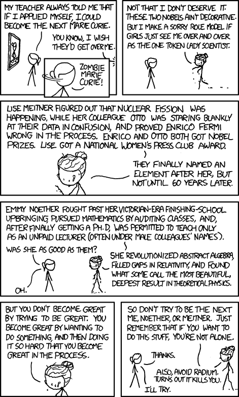
Three things linked by radium

I like to rail against people who read too much into coincidence. Having said that, radium (and Marie Curie) have popped up a lot in the past 24 hours.

A friend sent me this cartoon


I've just finished the chapter about radiation therapy in Siddhartha Mukherjee's (amazing) The Emperor of All Maladies: A Biography of Cancer (put aside 10 minutes to read this great New Yorker review)


And tomorrow on the radio I'm going to be talking about Lauren Redniss's Radioactive: Marie and Pierre Curie - A Story of Love and Fallout.

Monday, 9 May 2011

Recommendations for Miss H

A friend asked me over Twitter to recommend some books for his 13 and a half year-old daughter, who's currently into Cathy Cassidy, Kate Brian and Melissa de la Cruz (three authors who, to be honest, I've never heard of).

A little research showed that Cathy Cassidy is a British YA author of what look like girly early-teen stories; Kate Brian is the pen name of Kieran Scott, who writes love-and-friendship stories for the same audience; Melissa de la Cruz writes for the same audience again, with witches, vampires and werewolves.

So - not my usual bag. But I figured we could move from here into some fantasy, of the fairytale and dystopian vein.

The trilogies

Three coming of age series with strong female and male characters

Philip Pullman's 'His Dark Materials' - Northern Lights, The Subtle Knife, The Amber Spyglass)

Patrick Ness's 'Chaos Walking' - The Knife of Never Letting Go, The Ask and the Answer, Monsters of Men

Suzanne Collins's 'Hunger Games'

Time travel

I recommend Rebecca's Stead When You Reach Me to everyone I can. It is perfectly complemented by (in fact, is a direct homage to) Madeleine L'Engle's A Wrinkle in Time.

Everyone needs some Terry Pratchett

The Bromeliad series (Truckers, Diggers and Wings) - a community of gnomes tries to make it in the big wide world

The Tiffany Aching books - Pratchett is at his wisest and gentlest with these four books about the young witch Tiffany Aching

Everyone also needs some Neil Gaiman

Start with The Graveyard Book, then perhaps try Stardust (I have to say, I got all soppy over the movie version of this with Claire Danes too).

Ancient History

Rosemary Sutcliff's Eagle of the Ninth, the first of a series of historical adventure novels set in Roman Britain.

T.H White's Sword in the Stone (okay - more fantasy than history) - this book about the childhood King Arthur and his education by Merlin is still one of the wisest and funniest books I know.

Friday, 6 May 2011

The data's on the Wall

I've been having a bit of a poke around different digital collection interfaces lately, and one of the most appealing I've found is the National Museum of Australia's History Wall.


The History Wall is developed by Tim Sherrat (@wragge). It brings together a range of data sources: the National Library's People Australia and Australian Newspapers projects, the Australian Dictionary of Biography, the collection of the National Museum of Australia, the Australian Bureau of Statistics, the Flickr collections of the National Archives of Australia and the Powerhouse Museum, and the discussions of a historians' workshop held at the Museum in November 2009.

Items from these sources are presented in the context of 100 'defining moments'. Each time you visit the site or refresh the page the items that are presented change, giving you a different view of history. I can quite easily imagine the presentation writ large as a touchscreen interactive.

The thing I like most about this project - apart from the polished design - is that it lightly mixes curated, handcrafted content (the 100 defining moments) with data pulled directly from the content sources (ie. straight from catalogues and websites) (I assume it's pulled directly, there may be some magic happening behind the scenes). Digital collections rise and fall on the state of their metadata - this lightweight mixed approach provides anchors of carefully prepared material that collections items can be clustered around.

Wednesday, 4 May 2011

Now smell this

I've been a committed fan of Luca Turin since reading Chandler Burr's book about him several years ago, quickly followed up with Turin's own 'The Secret of Scent' and then more recently both editions of 'Perfumes: The Guide' (co-written with Tania Sanchez), which is without doubt the most-used reference book on my shelves.

Turin hasn't just changed the way I smell every day - he's changed the way I think of smell and experience the olfactory world around me.* He's the reason I've switched to biodegradable cleaning products, once I read that molecules from functional scents - the perfumes created for products from washing powder to hand soap - have been detected in fish. And he's turned me into a rabid reader of all things scent related.

Which is why I was delighted by Elisa Gabbert's review of a line-up of deodorants. Here she is on 'Degree Fine Fragrance Sexy Intrigue'

I predicted this would be some kind of gesture toward amber, and it is, a fruity, nutty, vanilla-ice-cream-type scent that has celebrity fragrance written all over it. It smells like a butterscotch sundae made with soft-serve and topped with extra maraschino cherries: chemical goodness. On skin it quickly loses its charm, turning even sweeter, and with a nod toward citrus that comes off like bug spray.

All this made me wish Imperial Leather had a deodorant range (and would go back to its original packaging).

*If you're interested, I'm Guerlain all the way: Vetiver during the day in summer; Habit Rouge and Jicky during the day in winter; Shalimar for nights out; Mitsouko when I feel like changing things up. One day I'll be an old old lady and I'll wear Nahema every day.

Monday, 2 May 2011

"Don't think about writing. Think about typing."

A wonderful interview by Salon's Laura Miller with Robert Gottlieb, editor, head of Simon and Schuster, then Alfred A. Knopf and then the New Yorker, and now reviewer and writer:
As I've told generations of writers who have writer's block, "Don't think about writing. Think about typing."

That, for instance, is how I started my Bernhardt book. I had no plan or outline, so I forced myself to sit down and I typed: "Sarah Bernhardt was born in July or September or October of 1844. Or was it 1843? Or even 1841?" That, of course, got me into it, but it also established the tone of the book. From there on it was easy until halfway through when I found that there were two stories -- the story of her career and her art, and the story of her notorious personal life and the world's reaction to it. So I had to stop and think, how do I divide this up? Luckily I have a structural mind, which you have to have if you're an editor, but I can't structure in advance.

I suppose the thing that makes it possible for me to do this is that I just don't think of myself as a writer. I think of myself as an editor. I provide myself with the copy and then I edit it. Look: Whatever gets you through the night.