The following are my notes for talks given in October at
Museums and the Web Asia in Melbourne, and the
National Digital Forum in Wellington.
The talks were my first attempt to synthesise the experiences, thoughts and conversations I had during my recent research trip I took around seven cities in the States, looking at how museums are reaching visitors using digital technology. The trip was generously funded by a
Winston Churchill Fellowship, with assistance from
Hutt City Council, the core funders of
The Dowse Art Museum.
As first attempts, the talk I gave at MWA ran overtime, and I had to skip a few sections at the end. The talk at NDF had a shorter time slot and I trimmed the presentation quite severely as a result. These notes are an amalgam of the two talks, with the addition of some musing on museum stores that didn't make it into either presentation. I'm also adding in some links to extra material that gives more context to the three key experiences that I'm focusing on here: the Pen at the Cooper Hewitt, the Ask App at Brooklyn Museum, and the DMA Friends programme at the Dallas Museum of Art.
I also had time to read an unusual amount while I was travelling.
This post brings together some of the articles, reports and presentations behind my thinking.
The talk was originally titled (in abstracts submitted pre-trip),
From Podcasts to The Pen: digital adventures in the United States, but for the purposes of this recording, let's call it:
Some context, three experiences, three observations, a concern, two ideas, a tangent, and some thoughts on a museum lead by the values of the web
URL to IRL
Every year, there is a new hotness in our sector. Right now, it's t
he Pen at the Cooper Hewitt battling it out with the
Ask App at Brooklyn Museum, while we also watch to see how the newly opened
Broad in LA does, modelling its visitor service experience on the Apple store aesthetic.
The year before that it as
the O at MONA and their no-marketing marketing approach facing off against
the DMA in Dallas introducing free entry and the Friends programme; before that,
Cleveland's wall,
the Walker's homepage,
Brooklyn's posse, the
IMA's Artbabble and
dashboard.
The main point of the trip was to try for myself, as a visitor, some of the much-publicised digital projects emanating from US museums. After flirting with all these entities online, now I was going to go and meet them face to face, right where they live.
I Can Break Anything
When I used to do user testing, my least favourite participants were the people who pride themselves on being able to "break anything" and therefore take the most perverse approach imaginable to the task at hand.
The day I arrived in the States the
Wall Street Journal published an article by Lee Rosenbaum - a veteran art reporter who also enjoys playing insider baseball - titled
The Brave New Museum Sputters Into Life, detailing a trip around a number of museums on a mission very similar to my own.
Rosenbaum wrote:
Surprised by my disappointing experiences with the digital gizmos that others had praised, I could only conclude that some of the proponents hadn’t spent much time using them and observing how others were using them. Intended to inform and delight, these innovations are often unintuitive, inadequately explained, or exasperatingly dysfunctional.
To which my retort is: you aren't a real visitor. Relatively few of the people who visit our places are museum-visiting experts. Fewer still would describe themselves as art experts. Even fewer are visiting with the explicit purpose of critique.
#WeAreNotNormal
So. I am not your normal visitor.
First up: I am not from around here. I purposefully visited cities - Dallas, Baltimore, Minneapolis, Indianapolis and I'll count Brooklyn in here too - that are not on the international tourist museum map. I picked museums that have a emphasis, like The Dowse, on repeat attendance by local residents.
And I am a professional. I was doing what I call a 'View Source' visit. On many of my visits to art galleries, I am so focused on observing floor staff, signage, lighting, hanging fixtures and such like that I sometimes have to remind myself that I'm actually there to look at the art.
I tried really hard on my trip to use these products with optimism and some joy in my heart, rather than being the mendacious mystery shopper.
So I hope you will take my experiences and observations with the honesty and self-acknowledged limitations with which I offer them.
DMA Friends, Dallas Museum of Art
After moving to the Dallas Museum of Art three years ago, director Max Anderson and his head of technology Rob Stein, who followed him from the Indianapolis Museum of Art, introduced free entry to the museum and a new free entry level of membership called the
DMA Friends.
The programme has three general aims:
- to promote the gallery to non-visitors
- to increase engagement and repeat visitation
- and to use the data gathered from tracking members of the programme to inform museum operations.
_ _ _ _ _ _ _
A series of Museums and the Web presentations document the project:
_ _ _ _ _ _ _
On the first day that I visited the DMA I watched front of house staff greet visitors to the museum and sell them on the Friends programme. People were remarkably happy to listen to the sales pitch, and I wonder if that’s partly because Texans are very polite, and partly because people still aren’t used to the idea of getting into a major museum without paying.
After lurking for a while I took the plunge and signed up myself. It was quickly clear that the programme was not about international visitors like me.
The system asks for your postcode – a key part of the tracking information, which is used to understand where visitors come from, and can be used to for targeting marketing and outreach. However, there’s no option for international visitors and instead the staffer used the work around he had developed – signing me up under the DMA’s postcode.
We also went through a screen where I was encouraged to choose and avatar. At this point the nice man said to me that I could skip this, because “they” had put in avatars for some purpose that hadn’t been realised, and he didn’t understand why they didn’t just take it out.
The way the programme works for the visitor is that you gather points in order to access rewards. In a city where everyone drives, the first objective is to gather enough points to get your parking at the museum redeemed. The nice man at entered a few cheat codes for me that bumped me immediately up to being up to get a free ruler from the shop.

So, signed up, I started exploring the galleries.
You gain points in several ways. Each gallery has a sign at its entrance with a code. You text the code to the programme, and it racks up points. You don’t actually have to enter the gallery or engage with the art, and correspondingly, this is a low point activity.
This was where it was reinforced to me that the programme was not for people like me. I stayed on my New Zealand data plan while travelling, and texting to international numbers costs me. Instead, I had to note down each of the codes, and then return to the kiosks in the museum lobby, log in to my account, and add them all manually.
It was just as well that this was a low value activity though. Because I was there to see the art, I missed most of the gallery entrance codes, which were surprisingly small and discreet. (So discreet, I totally forgot to take a photo.) I was following sightlines into exhibitions, rather than looking at the doorways as I went through them. I also tended to use the stairs that slip you between floors in the museum rather than the formal entries to the galleries, so tracking of my progress through the galleries would have been very inconclusive.
The other main activity that the DMA was offering on the day was a Faves scavenger hunt. I’m going to be frank – I hate scavenger hunts.
This shows you a Monet in the galleries with a Faves prompt on it. The DMA is enormous. I would have spent nearly four hours walking through it and I know I skipped a couple of ancient culture galleries. By calling them out for the Friends participants, these bright red cues were the only spots in acres of gallery space that were identified as important to the visitor.
A code for a Fave object earned you more points, but required no extra engagement on your part.
As I experienced it, the DMA Friends programme requires only modest effort from the visitor, and evoked correspondingly low engagement. The incentives – especially free parking – I can see being conducive towards encouraging people to visit more often. And of course I am now receiving a weekly email from the DMA encouraging me to visit more, spend more, and consider donating.
The Pen, Cooper Hewitt
Next up on my trip was the Cooper Hewitt in New York, and their new Pen.
_ _ _ _ _ _ _ _ _
The Pen received a lot of media attention before and after launch.
Here's The Atlantic in January this year.
_ _ _ _ _ _ _ _ _
Unlike the DMA Friends, where the programme is promoted but not a requirement for free entry, the Pen is given to every visitor at the Cooper Hewitt as part of the ticketing project. Every visitor receives a well-honed patter that takes the FOH staff member about 40 seconds to deliver, explaining how they can use the pen during and after their visit.
The pen has two ends: one that you press to an icon on the object labels to ‘collect’ them and then ‘download’ them onto interactive tables, and one that you use to play on the tables.
I loved the pen as an object. The act of pressing the pen to labels brought an extremely pleasant tactile and physical element to my visit which is usually lacking in galleries. I got to use my body (even to a small degree) in a way I don't normally, and the tool was unique and special to that place, not like reusing the device I use ubiquitously in the rest of my life.
Where the pen became a little pesky when I was trying juggle using it, my phone to take photos, and my notebook and pen to make notes about my visit – but once again – not your normal visitor.
It was when looking at a collection show about the different elements of design that I was really struck by the underlying power of what Seb Chan and his team at the Cooper Hewitt have made.
This is a bad photo taken through a perspex case of an early 20th century bracelet and a early 21st century piece of medical technology used in shoulder reconstruction surgery. The two objects seem very unrelated.
When I read the label though, another layer was revealed to me. The labels includes the tags assigned into the collection database to each item. In the case of the implant, the first two words as aesthetic descriptors: ‘lace-like’, ‘snowflake’. Everyone who’s worked in an art gallery has seen a bit of dumb database curating – we’ll do a show with all the works with fish in them. This was database curating on a very different level.
That moment changed my perspective on the exhibition. A group of things that are ‘blue’ was suddenly a different thing, a much smarter display that indicated to me the underlying power of the souped-up collection database.
During my visit I came to perceive the Pen as the most recent point on a design continuum that stretched from the beautiful historic home the museum is housed in, out through its collections, and up to the contemporary visitor experience. This slightly shitty photo summarises that. I’m standing in the carved teak library, an original part of the building and a glorious bit of craft. In the distance is an Issey Miyake dress. Between me and the dress are two people using the pen on one of the interactive tables. It’s design across the centuries, objects made to be used and enjoyed by humans, design history in action.
Of course, nothing is perfect, I know the team openly acknowledges that touring exhibition pose a problem.
The wonderful Heatherwick Studios touring show is displayed as a series of pods devoted to individual projects: the integration of the pen is limited to panels attached to the walls around the galleries where you could ‘collect’ the various displays. This breaks the user experience pattern set by the rest of the museum, and given that the panels are modest to the point of invisibility, in these spaces I didn’t see anyone else except me – dutiful expert visitor – using their pen.

I also felt that the design interactives on the tables undermined the beautiful insights about design I had had earlier. This observation is also coloured by working with designers over the years. On the tables you can design certain objects (lamps, chairs) by selecting the form and materials and then sketching lines. As you can see above, I chose a lamp and concrete and with two intersecting lines made an elegant form. I felt that an interactive where drawing two shaky lines could design a perfect concrete lamp undersells the true difficulty of the design process.
The very last place I visited was the hands-on design exploration studio on the ground floor of the museum, tucked through a doorway after the tables that I used above. On walking into the room (which was powerfully air-conditioned, and empty) I realised my haptic needs had been met already on my visit. I didn't want to twist cellophane and hessian around wire armatures to make lightshades because I'd already done things like that. I wonder though if this is a #NotNormal experience: the room probably works great for education visits.
I also have to admit to being one of those people who never visited their URL after their visit. I flirted with the idea of doing it for the sake of completeness, but I decided to to stay true to my visitor inclinations. Instead, my online relationship with the Cooper Hewitt continues through all its usual 'micro-touches' we’ve established with each other. I follow the Labs blog and Twitter account, and several staff and ex-staff on social media. Again, this is #NotNormal, but think of the 16,500 people who follow
Thomas Campbell on Instagram - these micro-touches are for me are a much more compelling part of my life than a URL.
Ask app, Brooklyn Museum
The Brooklyn Museum was the last of my three major experiences on my trip.
_ _ _ _ _ _ _ _
Start off your exploration of the Ask app with
Nina Simon's interview with Shelley Bernstein and Sara Devine, and follow up with
Shelley's recent MuseumNext presentation.
As with the Pen (both projects, it's worth noting, are funded through Bloomberg Connect) the Ask app is part of
a wider restructuring of the physical visitor experience. One change by the time of my visit: the mobile desks at which the Ask responders sit had been moved out of the lobby, and into a non-visitor space. I feel this is a real loss in terms of both advertising the app to visitors and to making a statement about the aims of transparency and connection.
Brooklyn Museum staff have been
thoroughly documenting the project on the BM's Technology blog; everything from hiring the respondents to using Agile to testing the beacons.
_ _ _ _ _ _ _ _ _
As I progressed from the DMA to the Cooper Hewitt to Brooklyn, the demands each product placed on me grew: at the same time, the engagement I experienced increased.
Unlike the DMA, where you sign-up on site, and the Cooper Hewitt where every visitor is given a pen, the Ask app is not integrated into the entry process. You download it in advance, or notice a sign in the building promoting you to do so. Uptake is currently low – one or two percent of visitors, I think.
The app lets you live message a group of trained staff with questions as you travel around the museum. They can pinpoint you using beacons, or you can signal your location through text and photos.
This was the product I had to push myself hardest to use. I don’t find on many visits that I naturally have more questions about the art on display. Where the DMA Friends was about picking up breadcrumbs and the Pen was a ‘oh-that’s-interesting-press-press-press’ interaction, to get started with the Ask app I had to think of a question that was worth asking, that hadn’t already been answered by the exhibition labels. I found this strikingly difficult.

My first question was a slightly frustrating experience. I had a very specific question about a particular Gerrit Rietveld chair, and who would have access to buy it. What I was asking was ‘Was this on the general market or did you have to know the designer to get one?’. The answer the Ask team sent me though, in a series of small chunks, gave me context about the chair, the fact that the general public wasn’t interested in avant garde design, and only in the fourth message told me that actually no, only the artist’s mates every got hold of one of these chairs.
I was intrigued by how the app grew on me though. I found that I was generating more questions than usual, and instead of shelving them like I usually do, I asked them.
I also felt like I struck up a rapport with the Ask responder, and I started sending through observations rather than questions. I almost felt like I was visiting with a friend and having discussions in the galleries, rather than having a solitary experience.
Not everything was perfect, of course. The Brooklyn Museum has these odd elevator lobby spaces where they install sculptural works, and they feel like liminal spaces rather than art spaces.
I almost – bad professional - genuinely thought I could touch on particular sculpture, so I shot that question through to Ask – and didn’t get a reply for another 10 minutes, by which time I was several hundred metres further into the floor. As there is very little seating in the museum's galleries, it was difficult to pause and wait for an answer.
Shelley Bernstein at the Museum acknowledges that one of the areas they need to work on are the question prompts scattered through the galleries to encourage uptake and use of the app.
Where I found myself asking very detailed questions, and
a recent blog post from the museum detailed a three-hour long exchange on the symbolism and use of the colour blue in art through the centuries, the question prompts tacked onto cases and walls were dumbed down in comparison to the traditional object labels they were juxtaposed with.
Like the DMA faves, the signs grab your eye, but the tone is the opposite of the experience, and felt patronising or try-hard. They undersold the deep engagement the Ask app delivers.
Another distinctive feature of the Ask app is that when you leave the museum, your conversation disappears. I didn’t even notice this, and when I was alerted to it, I felt like it made sense: that’s how conversations work in real life. Others I’ve talked to want to be able to access this information after their visit. And it is worth noting that the museum is storing and analysing your conversations – even when you don’t have access to them.
So, which is best?
This is the ultimate wrong question. At a fundamental level, there is no point comparing what these three institutions have done. You can compare any number of factors and not come to an answer, because each has been developed in response to a very different question: How can we widen our visitor profile? How can we communicate design in its fullest sense? How can we help people thinking curiously about art?
What I do have though is a few broad observations that developed along my trip.
Observation 1: Global to Local
Where five or ten years ago we were all talking about reaching the whole wide world through the web, today art museums especially are trending from global to local. From thinking about serving the whole world, the focus has shifted to the physical visitor.
This has happened most clearly at Brooklyn Museum.
In April last year Shelley announced a change of focus to the physical visitor, which meant quitting platforms such as Flickr, HistoryPin, FourSquare. A few months later the Posse and the two tagging games were shut down.
This decision – and the development of the Ask app – was shaped by their observation that earlier digital community engagement projects had been most deeply used by people who lived within 5 miles of the museum.
At Museums and the Web Asia last week in Melbourne, there was some discomfort about the idea of valuing the in-gallery visitor over the online visitor, and of even drawing a distinction between the two modes and/or groups.
I have a lot of sympathy for this position. 80% of my funding comes from Council, which means from the 45,000 rate-paying households in Lower Hutt. Effectively, each of those households is paying for an annual membership to my museums, and my first duty has to be towards creating value for them from that enforced donation.
However. I often talk about 1st degree and 2nd degree effects for rate-payers. There are the experiences and benefits they can gain from using the museums as visitors. But there are also the benefits that accrue to ratepayers when their city it is the home of a respected and well-known cultural institution, through venue hire, tourism, media coverage, and that intangible but very real sense of pride.
Observation 2: Digital as USP
That leads to my second observation. Traditionally, a museum’s brand has been built on buildings, collections, and exhibition programmes.
Something that really struck me on my trip – perhaps because I was looking for it, rather than because it is new – is that digital is definitely the newest way of branding an institution. And unlike buildings, exhibitions programmes, and collections, a new digital brand can be forged relatively rapidly.
DMA’s digital brand is about a commitment to inclusion – widening their audience beyond the country club that previously felt at home in the museum.
Cooper Hewitt's brand says that design is an integral part of being human, and each of us has a designer inside us.
The Brooklyn Museum’s brand says that people are intelligent and curious about art and warrant personal responses to their curiosity. And these brands are being heavily communicated out through messages to members, funders, stakeholders, residents, and the general public.
There is a distinct danger though of your digital brand being, or becoming, disassociated from your physical experience.
My clearest experience of this was visiting the
Walker Art Center in Minneapolis. A few years ago we had Nate Solas from the web team at the Walker give
a keynote at NDF on the Walker’s website redevelopment, which was carried out on a philosophy of unusual generosity and outward-looking-ness, and with the aim of supporting the local art community as well as positioning the museum internationally. I found their way of thinking inspirational, and have tried to follow it in the way we behave online at The Dowse.
Alongside the web redevelopment ran the
Open Field programme, where as grassy area in front of the building, intended for a building extension that hadn’t been realised, was turned into a community-focused performance and activity space, hosting everything from yoga classes to internet cat video festivals.
Following all this made me feel really close to the Walker, despite never having visited. And so when I rolled up two weeks ago, I had incredibly high expectations.
Now, don’t get me wrong. It’s a beautiful building with really interesting gallery spaces, gorgeous lighting, a great collection, stylish wayfinding. But there was none of that generosity and freshness I felt online. And the biggest surprise was that Open Field had been stopped, most of the staff involved had moved on, and the physical space was literally being dug up in front of my eyes.
One of the greatest attractions of the web is the speed of change and the emphasis on experimentation. We on the web side often joke about museum-time, and the glacial pace of change. Perhaps though we need to think about how we make enduring digital change, where the values of our work can be sustained, even if the forms it takes are constantly evolving.
Observation 3: Web merging with Visitor Services
A third trend that struck me as I travelled from museum to museum was the increasing merger of web teams and visitor services.
Sometimes this was taking a very concrete form: at the Baltimore Museum of Art, for example, Suse Cairns, their digital content coordinator, has just been put in charge of their visitor services team, bringing together the management of online and physical visitor experience.
In another example, I met with six people at the DMA from Rob Stein’s team, and four or five of them recounted the same story.
When director Max Anderson arrived at the museum three years ago, gallery attendants were there solely to protect the art, and were actively discouraged from making eye contact or talking with visitors. If a visitor had a question in a gallery, they were to be conducted to the front desk where a qualified person could deal with them.
Nick Poole tweeted this while I was travelling, and the sentiment really resonated with what I was observing. The DMA – like many other US museums – is starting on a backfoot when trying to create a more inclusive and welcoming visitor experience. There’s no way an app can fix that visitor experience on its own.
In fact, by the time I got to the end of my trip, my conclusion was that most museums should be ditching these visitor-focused apps and instead investing in more training, more empowerment, and more autonomy for their visitor services staff. Sadly though, it’s a damn sight easier to get funding for a new app than to pay your front of house staff more.
The other thing I observed was the energy going into studying visitor behaviour, and especially that of members. The DMA Friends programme taps this. At Museums and the Web Asia Diana Pan from MOMA demonstrated the data they’re collecting on their members and the decisions they’re making using it. Mia in Minneapolis is preparing to roll out a major programme around free membership which will collect information about visit frequency, event attendance, shopping and donation habits.
In the States, the word ‘leveraging’ is uttered in conjunction with the word ‘engagement’ much more frequently than it is down here. But in an environment of decreasing public funding, and not-increasing business support, the move towards digitally tracking our visitors so we can study their behaviour is coming to us all. The choice in front of us will be whether our use of this data tilts in favour of creating value for our visitors or for ourselves.
[This is where my NDF talk finished.]
A concern: moonshots
One of the side effects of this shift from global to local is that on my trip I encountered much less talk about moonshots - about big hairy projects that seek to explore the places where museums and everything else blend.
I think partly this was because many of the people I was meeting with were in a heavy implementation phase of their work.
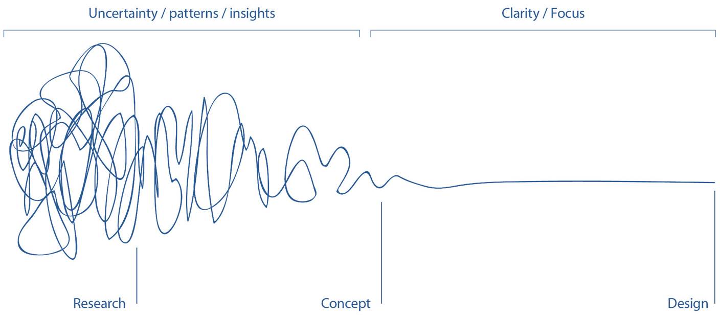
I'm sure many of you will be familiar with the metaphor of the design squiggle - the heady period of ideas, exploration, big claims and false starts you go through before you settle on and refine your final direction. I feel like as a sector we are in a refinement and implementation period, not a design period. Small innovations and tools are piling up on top of each other, but they're not dramatically changing the landscape in even the ways putting our collections online, or adopting social media, did.
I think we need to carve out more space for basic research, that kind of focused noodling around that isn't measured by practicality or applicability, but that opens us to opportunities and big changes. I don't know how we do this, but I do believe it is the responsibility of our national and large institutions, who have the staff resources to make this possible, to be explicitly promoting new, outward looking thinking and activities that might not have an immediately discernible application.
[NB: the presentations I saw coming from science and natural history museums at Museums and the Web seemed more in the mode of moonshots. Maybe it's art museums in particular who seem to be at this stage, or maybe this is just selection bias on my part. I'd love to hear of any projects out there you feel to be moonshots.]
An idea: Doing more with less
[This is possibly where I started slicing sections out of my Museums and the Web talk as I raced towards the end of my presenting time.]
This is at the other end of the spectrum from moon shots: I want to make a call for digital developments focused on improving our productivity.
We have all had quite enough of this phrase, but it's not going away. I know in my own case my annual budget is remaining static at best year on year, and I fully expect to this year be asked to find between 5 and 10 percent savings, while at the same time being expected to increase visitor numbers and do things bigger brighter things.
All of us have invested in being more visitor focused and making our institutions more diverse and accessible.
How many of us have applied this same level of energy to understanding where the pain points and wasted effort lie in the way we work, and seeking to address this?
I have two modest suggestions for where we can start, both to do with collections management.
The first is digitising our loan processes. Art museums constantly circulate collection items between ourselves, and the process is frustratingly paper-based and slow. In the age of the API, surely we can band together, pool our pennies, and make something that could largely automate this process, and free up our time for more valuable work?
My second is centralised rights clearance with artists. In a country the size of New Zealand, with an artistic population the size of ours – or even you guys, Australia – it is ridiculous that we are all individually trying to obtain and maintain rights information. We could save so much time and hassle if we could all just cede a little control, and develop a centralised system and either a dedicated or a distributed staff of collection managers and registrars from larger organisations.
An idea: An app for the attendants
One of the many, many, many articles I read about The Broad while I was travelling,
one that stood out in particular talked about how their gallery attendants have been trained about the art on display, are allowed to wear their own clothes – as long as they’re fully dressed in black – and how many are art students or teachers.
The writer stated:
The Chrysler Museum of Art in Norfolk, Virginia., may be the only other art museum that has attempted to train staffers to fully fulfill the seemingly contradictory functions of keeping the art safe while making viewers feel comfortably at home with it.
I think this is such a dumb dichotomy, but in American museums it is very real. So I want to return to that merger of web and visitor services.
Wilson himself worked as a museums guard when he was at university. His work talks about how guards are expected to be anonymous, inconspicuous, to be visible and invisible all at once. Here the guards are the centre of our attention – and yet they can’t look back at us. And they are black, as were the vast majority of the people I saw in the States employed in this entry level, low paying, and largely unempowered role.
I spent a summer working the floor at Te Papa in Wellington and the two weeks training I received there was both the more intensive induction I’ve experienced in a role, and the most diverse team I have ever been part of. Many of the visitor-fronting apps and digital developments we’re seeing today would be rendered redundant if we paid and trained our front of house staff better.
So – seeing as digital developments are relatively easy to fund, compared to recruitment and staff salaries – could we make an app that empowers our gallery attendants? That gamifies their experience, rather than that of the visitor, a way of recording when and where they talk to visitors, and about what, and then allowing the data that is collected to be used to understand where visitors spend their time, what their questions are about, when different parts of our buildings are used and why – visitor research carried out by every staff member on the floor.
A tangent
This has little to do with my talk's topic, but a lot to do with what I observed on my trip.
Richard Harding, a consultant for museum shops, said two things that really snapped to the grid for me.
First, he pointed out that few people who come to our museums are expert museum-visitors, but most are expert shoppers. The museum store is where they can orient themselves, but also where they will judge your efforts in a much more knowing way than your wayfinding, your lighting, or your interpretation.
Second, a person who is visiting you on purpose – who has researched their trip and is making an effort to come see you – will often visit the store to build their anticipation. And then at the end of the visit – assuming it has gone well – they go back to the store, looking to tie a bow around their experience.
My visit to the States really underlined this for me. The best stores I saw – Mia in Minneapolis, and the American Visionary Art Museum – did more than offer things you'd like to buy. They communicated the personality of the museum, its collections and exhibitions, its community or celebrity connections, the things it valued.
But the third thing I figured out was this. Much of that deep engagement – long looking, discussion between people, evaluating what you've seen and how you felt about it - naturally occurs in shops. Shopping is for many a social experience, and for most of us a way of testing how our identity is reflected in or measures up against the external world. IIn Baltimore,
Nancy Proctor passed on to me an insight from
Jon Alexander:
We are moving from a consumer culture to a participatory culture: from giving the customer what they ask for, to wrapping an experience around what we have to offer. What if we were to pave the cowpaths, and start looking at our shops spaces as the best-placed sites for enhancing participation and a sense of connection?
The Dowse's store operates on a very small scale, and is stocked and managed by our front of house team leader, in about ten hours a week max. But we're steadily introducing new ideas for stock and presentation, and using the POS system data to evaluate them, trying to draw a closer connection between the collection, exhibitions and the shop, and the overall message: the beauty of the handmade object, and every visitor's ability to support people who make art. We hope to present on this topic more fully at next year's joint
Museums Aotearoa / Museums Australia conference in Auckland.
In conclusion
I come to museum leadership from the web, and the web is where I learned my working life values.
My inspiration for the way I work comes not from an artist, great museum director, or figure in the humanities. Instead it comes from Tim O'Reilly, publisher of tech books, open web advocate, and populariser of the terms 'open source' and 'web 2.0'.
The secret of social media is that it’s not about you, your product, or your story. It’s about how you can add value to the communities that happen to include you. If you want to make a positive impact, forget about what you can get out of social media, and start thinking about what you can contribute. Not surprisingly, the more value you create for your community, the more value they will create for you.
I have boiled that down to this ...
It’s about how you can add value to the communities that happen to include you. Not surprisingly, the more value you create for your community, the more value they will create for you.
I believe that those of us who have come of age as museum tech professionals have a unique set of values and approaches to our work that can form the bedrock of the modern museum.
Usability
Accessibility
Transparency
Openness
Experimentation
Craft
Sharing
Creating value together
The things we hold dear fit seamlessly into the modern museum. I don't believe in sitting around debating how we can be relevant in the 21st century. No one else exists to do the jobs we do. People want to experience what we make, people want to make it with us, people trust and value us.
So my final question is this: how do you create value? How could you create more? If it's not about digital, if it's all about value - what can you do? What can we all do together?
Thank you