Among these are several designers/design companies who I've started following relatively recently thatspecialise in data visualisation, including David McCandless's 'Information is Beautiful' and the amazing people at Berg.
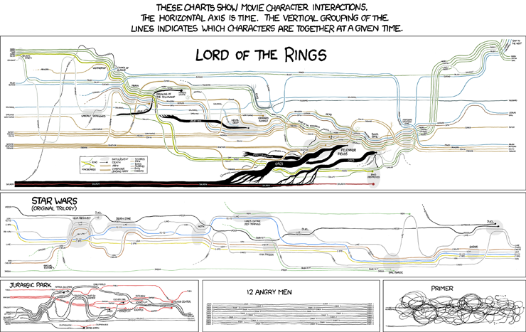
Over the past week, xkcd's visualisations of character interactions have been doing the rounds on the web (click here for the mega-full-size version, with Lord of the Rings galore)
This morning on my walk to work I was pondering some of the visualisations I'd like to see, relating to the New Zealand art world. Like:
The movements of a group of similarly-aged artists (e.g.Shane Cotton, Seraphine Pick, Michael Parekowhai and Peter Robinson) between dealers over the past 20 years.
A breakdown of the budgets for out 4 outings at the Venice Biennale (including the Trip of a Lifetime) including accommodation, meals, marketing, PR, materials, venue hire, flights, publications, photography; all measured against attendance and press coverage.
The distribution of McCahon works in public collections, measured in square centimetres.
Touring exhibitions of New Zealand art, showing relationships between originating and displaying institutions.
No comments:
Post a Comment